
About Ably
Ably is a realtime infrastructure company. We build the platform that powers live experiences — chat, collaboration, data streaming, AI agent communication — for companies operating at scale.
Why we exist (Purpose): To make the online world better with realtime experiences.
What we want to achieve (Mission): To become the definitive realtime experience infrastructure of the Internet.
Brand personality
Our brand personality is Expert Confidence: the calm, senior engineer you trust in a crisis. We speak precisely, teach generously, and back every claim with evidence. We are dependable without being dull, and technically authoritative without being arrogant.
Primary archetype: Sage — We teach clearly, document deeply, and prefer evidence to rhetoric. Knowledge sharing is a core value, not a marketing tactic.
Secondary archetype: Ruler — We emphasise control, standards, and reliability. Our SLAs, architecture transparency, and operational discipline signal that we take responsibility seriously.
Tertiary archetype: Magician — When we make complex realtime problems feel simple through well-designed abstractions, we earn delight without resorting to hype.
Core values
- Bias for action — Take thoughtful action. When we have enough to act, we act.
- Bold creativity wins — The bigger the challenge, the bolder the thinking.
- Dependable by default — Dependability starts with our people, not just our technology.
- Even the best do better — Improvement is an ongoing journey fuelled by curiosity.
- Open for all — Open source, open minds, open communication. It's better when it's open.
- Technology needs humanity — Our technology means little without people.
On playfulness
We are a serious brand with a human streak. Playfulness appears at the edges — a wry CTA, a warm turn of phrase, a moment of personality in developer docs. It never undermines credibility or competes with clarity.
Logo
The Ably logo comprises two elements: the symbol and the logotype. Together they form a mark that is simple, bold, and designed to maintain visibility and legibility at smaller sizes.
Logo design
The symbol is made of 4 lines representing the 4 Pillars of Dependability. It conveys a sense of dynamism and scale through the orange gradient and the arrow in the negative space.
The logotype uses geometric forms to create a simple and bold look and feel.
Clearspace
Clearspace is calculated as the height of the lowercase 'l' in the wordmark, applied in all directions. No other elements should appear within this zone.
Logo priority
Use the horizontal logo by default. Only move to the next variant when space constraints require it.
| Priority | Variant | When to use |
|---|---|---|
| Primary | Horizontal | Default — use in all standard contexts |
| Secondary | Vertical | When horizontal space is limited |
| Tertiary | Symbol only | Where the brand is already established or space is highly constrained — favicons, app icons, profile pictures |
Variants
The core logo files below are available in this repository. For the extended logo set — including mono variants, badge formats, and additional file types — browse the full collection on Dash.
Horizontal
The default layout — symbol and logotype arranged side by side.
| Variant | Download |
|---|---|
| Light background, colour | SVG · PNG |
| Dark background, colour | SVG · PNG |
Vertical
Symbol positioned above the logotype. Ideal for square or compact spaces where the horizontal layout doesn't fit effectively.
| Variant | Download |
|---|---|
| Light background, colour | SVG · PNG |
| Dark background, colour | SVG · PNG |
Symbol (Badge)
The symbol used alone, without the wordmark. For use where the Ably brand is already established or in highly size-constrained contexts. Available as a square, circle, or standalone mark.
| Variant | Download |
|---|---|
| Colour | SVG · PNG |
Incorrect usage
The following examples highlight incorrect usages to avoid, as they can compromise brand integrity and recognition.
- Don't use the wordmark without the symbol
- Don't adjust the space between the symbol and wordmark
- Don't add a gradient to the wordmark
- Don't use other colours or gradients for the symbol
- Don't distort the logo — always maintain the original aspect ratio
- Don't adjust the proportionate relationship of the wordmark and symbol
Colours
Ably's colour system is built around three primary brand colours, a full neutral scale, a secondary palette for data and product contexts, and a set of functional GUI colours. All exact token values are defined in assets/colour-tokens.json.
Primary brand colours
Three colours form the foundation of the Ably brand.
 Ably Orange
#FF5416
CTAs, primary actions, logo, brand moments
Ably Orange
#FF5416
CTAs, primary actions, logo, brand moments
 Primary White
#FFFFFF
Backgrounds, cards, inverse text
Primary White
#FFFFFF
Backgrounds, cards, inverse text
 Primary Black
#03020D
Headings on light backgrounds, dark-mode backgrounds
Primary Black
#03020D
Headings on light backgrounds, dark-mode backgrounds
Neutral scale
The neutral scale runs from white to near-black and underpins all UI surfaces, borders, and typography.
 Neutral 000#FFFFFF
 Neutral 100#F6F8FA
 Neutral 200#EEF1F6
 Neutral 300#E6EAF0
 Neutral 400#D9DDE4
 Neutral 500#C6CED9
 Neutral 600#A7B1BE
 Neutral 700#8992A4
 Neutral 800#687288
 Neutral 900#575D71
 Neutral 1000#3F4555
 Neutral 1100#2C3344
 Neutral 1200#141924
 Neutral 1300#03020D
Orange scale
The full orange scale. Orange 600 is the signature brand colour — use it intentionally and sparingly.
 Orange 100#FFF5F1
 Orange 200#FFE3D8
 Orange 300#FFC4AE
 Orange 400#FF9C79
 Orange 500#FF723F
 Orange 600 ★#FF5416
 Orange 700#FF2739
 Orange 800#E40000
 Orange 900#B82202
 Orange 1000#751500
 Orange 1100#2A0B00
Secondary palette
Supporting colours for product colour coding and data visualisation. Not for core UI elements or large areas of the interface.
Yellow
 Yellow 100#FFFBEF
 Yellow 200#FFF0BA
 Yellow 300#FFE27C
 Yellow 400 ★#FFD43D
 Yellow 500#F8C100
 Yellow 600#E8A700
 Yellow 700#AC8600
 Yellow 800#654F00
 Yellow 900#291C01
Green
 Green 100#F1FFF1
 Green 200#B8FFBB
 Green 300#80FF85
 Green 400 ★#08FF13
 Green 500#00E80B
 Green 600#00C008
 Green 700#008E06
 Green 800#005303
 Green 900#002A02
Blue
 Blue 100#F1FBFF
 Blue 200#B8EAFF
 Blue 300#80D9FF
 Blue 400 ★#4AD4FF
 Blue 500#2CC0FF
 Blue 600#00A5EC
 Blue 700#0284CD
 Blue 800#004B75
 Blue 900#001B2A
Violet
 Violet 100#F7F2FE
 Violet 200#D8BCFB
 Violet 300#B986F8
 Violet 400 ★#9951F5
 Violet 500#7A1BF2
 Violet 600#5F0BC9
 Violet 700#460894
 Violet 800#2D055E
 Violet 900#130228
Pink
 Pink 100#FFF1FC
 Pink 200#FFB8F1
 Pink 300#FF80E6
 Pink 400#FF47DB
 Pink 500 ★#FF17D2
 Pink 600#D400AB
 Pink 700#9C007E
 Pink 800#630050
 Pink 900#2A0022
GUI colours
Functional colours for interactive elements and system states.
| Name | Light | Swatch (light) | Dark | Swatch (dark) | Usage |
|---|---|---|---|---|---|
| Blue default | #006EDC |  | #4DA6FF |  | Links, primary buttons |
| Blue hover | #0862B9 |  | #2894FF |  | Hover state |
| Blue active | #074095 |  | #0080FF |  | Active/pressed state |
| Blue focus | #80B9F2 |  | #80B9F2 | | Focus ring (keyboard navigation) |
| Disabled | #AFB9C5 |  | #676B7A |  | Disabled elements |
| Success | #11CB24 |  | #11CB24 | | Confirmations, positive indicators |
| Error | #FB0C0C |  | #FB0C0C | | Errors, destructive actions, validation failures |
Brand gradient
Active Orange — #FF5416 → #FF2739

Default direction: lightest at bottom-left, darkest at top-right. May be applied in any direction that suits the design. Used for hero sections and feature highlights.
Usage principles
Orange is a signal, not a fill. Small pops of Ably Orange beat flooded surfaces. Use it to draw attention to what matters.
Neutrals do the heavy lifting. The neutral scale carries most of the UI. Colour is the exception, not the rule.
Secondary colours are for data and product contexts. Yellow, Green, Blue, Violet, and Pink are for charts, dashboards, and product colour coding — not core UI or large decorative areas.
Orange 600 in data visualisation only identifies Ably. When comparing Ably against external metrics, Orange 600 may represent Ably specifically. It should never be used for generic or industry-wide data themes.
Dark mode. Each neutral swatch maps directly to a dark mode equivalent — see the token file for full mappings.
Typography
Ably's type system is built on two typefaces — Manrope for all brand and UI text, and JetBrains Mono for code and technical content. Full token definitions are in assets/typography-tokens.json.
Typefaces
Manrope

Ably's primary typeface. A modern, open-source sans-serif used for everything from display headings to body copy. Geometric with optical adjustments for high legibility at all sizes.
- License: SIL Open Font License
- Available on: Google Fonts
- Fallback: System sans-serif
JetBrains Mono

Used exclusively for code samples, technical content, and data displays.
- License: SIL Open Font License
- Fallback: System monospace
Weights
Four weights form a clear visual hierarchy. Don't use weights outside their defined roles without purpose.
| Weight | Value | Role |
|---|---|---|
| Bold | 700 | Titles, headlines, emphasis, display headings, brand moments |
| Semibold | 600 | Sub-heads, section labels |
| Medium | 500 | Body copy, default reading text |
| Regular | 400 | Quote texts, captions, supporting text |

The default pairing is Bold for headings + Medium for body. Aim for two weights per page or slide — a third is acceptable in complex, multi-section layouts. Never use more than three.
Type scale & hierarchy
Context-setting overline
Hi, I'm a heading in Bold
I'm an optional sub-head in SemiBold, great for expanding upon the headline theme and setting the reader's expectations of what's to come.
I'm a standard paragraph in Medium. This offers the perfect balance for body copy, ensuring readability without sacrificing style. Its versatility makes it ideal for extended reading, providing a comfortable visual experience that keeps users engaged.
With a line height of 160%, body copy achieves optimal readability and visual comfort. This spacing prevents eye strain and promotes better content scanning.
Display
- Role: Page titles, hero headings, major brand moments
- Weight: Bold (700)
- Sizes: 40–48px
- Letter-spacing: Tighten at larger sizes — roughly -1% to -3% of the font size, increasing proportionally as size increases. Apply where tooling supports it.
Headings (h1–h5)
- Role: Section headings within a page
- Weight: Bold (700)
- Sizes: 16–40px
- Letter-spacing: Same principle as display — tightens progressively with size, tapering off at h4/h5.
Subheads
- Role: Section labels, decorative headers, category markers
- Weight: Semibold (600)
- Size: 18px
Body
- Role: Running text, paragraphs, descriptions
- Weight: Medium (500)
- Sizes: 15–16px — p1 (16px, standard) and p2 (15px, compact). Each has a bold variant for inline emphasis.
Rules
Alignment — Left-align by default. Centre-alignment is acceptable where intention and layout allow. Never centre-align body copy, documentation, or UI text.
Line height — Always use relative values, never fixed pixels. Tighter for headings (~1.2), more open for body text (~1.6).
Letter-spacing — Tighten on larger headings where the tool allows. Use rem units in code; apply visually in other tools or leave at defaults.
Mixing weights — Aim for two weights per page or slide. A third is acceptable in complex layouts. Never exceed three.
Fallbacks — When Manrope is unavailable, use the system sans-serif. When JetBrains Mono is unavailable, use the system monospace. Manrope is available on Google Fonts for use in Google Docs, Slides, and Sheets.
Ably visual language
Ably's visual language is technical, confident, and crafted. It speaks directly to a technical audience through familiar concepts — code, data flow, connectivity, system architecture, and the live app experiences they enable — while maintaining a level of polish and intentionality that signals enterprise credibility.
The aesthetic is predominantly dark-themed, using depth and layering to create a sense of sophisticated infrastructure. Colour is used with restraint — orange appears as controlled accents, while secondary colours carry the weight in data-rich and product-specific contexts. The overall feel is of a precision-engineered system: clean, dynamic, modular, and purposefully composed.
👁️ See it in practice — for visual examples of the language in use across specific contexts, see the dedicated reference sections throughout this guide.
Core principles
Dark by default. A near-black with a subtle cool tint is the canonical background, and a deliberate counterpoint to the heat of Ably Orange. It creates contrast for orange accents and white typography, and positions Ably firmly in the infrastructure and developer tooling space. Light themes exist but are contextual — primarily for in-article blog imagery and example/demo UI contexts where the end-user product determines the aesthetic.
Colour as signal, not decoration. Orange appears in precise, intentional moments — the logo, a CTA, a key metric, a highlighted connection. Secondary colours (violet, green, pink, blue, yellow) carry product and data contexts. Neither is used to flood surfaces. Neutrals do the heavy lifting.
Depth through layering. Compositions use multiple planes — background glows, mid-ground containers, foreground UI elements — to create a sense of infrastructure at scale. Frosted glass cards, gradient-stroked containers, and soft ambient glows give designs visual weight without visual noise.
Technical as aesthetic. Code snippets, system diagrams, API method calls, SDK connection flows — these are not supporting material. They are the visual centrepiece. Showing how Ably works is as important as showing what it enables.
Connectivity is the narrative thread. Dashed connector lines, node-to-node relationships, data streaks, and presence indicators all reinforce the idea of things being live, connected, and in sync. This thread runs from product hero images through to feature diagrams and blog imagery.
Colour application by context
Product hero backgrounds always use the canonical near-black background, with product category colours applied as glows and accents to create visual distinction across the suite:
| Category | Colour | Products |
|---|---|---|
| Data primitives | Pink | Pub/Sub |
| App services | Blue | Spaces, Chat |
| Data services | Green | LiveObjects, LiveSync |
| AI services | Violet | AI Transport |
Feature visuals and diagrams use the near-black background with violet as the primary accent for AI and agent-related concepts, and orange for Ably-specific connections and data flow indicators.
Blog lead images follow the same dark system when illustrating technical concepts — icon badges on dark cards, connected by glowing lines on violet or dark backgrounds.
In-article and example visuals can use light themes when depicting end-user product contexts. These use white or near-white backgrounds with the neutral scale, and rely on green, blue, and other secondary colours for data states (up/down, live/offline, positive/negative). Orange does not appear in these light-theme contexts unless identifying Ably specifically.
Composition patterns
Product heroes
Full-bleed dark background with a coloured ambient glow centred behind the hero visual. The hero visual shows the end-user experience — real UI, real interactions, real data. Framework and technology icons (React, JavaScript, Swift, Kotlin) appear as floating badges alongside the UI, reinforcing the technical audience. A metric row (large orange numerals, small neutral descriptor text) grounds the composition in proof.
Feature and example visuals
Paired-back illustration style that focuses on the purpose of the feature or capability being shown. The composition centres on the mechanism — data flow, system interaction, agent coordination — rather than the broader experience it enables. Ably's role in the interaction is consistently highlighted through orange accents. Theme is determined by context rather than a fixed light or dark default.
Blog lead images
Crafted compositions that connect Ably's infrastructure and products to the subject matter of the article — whether that's a specific technology ecosystem, a use case, a product capability, or a partner integration. The visual style follows the same dark aesthetic and brand element system as the wider visual language, adapted to the topic and scaled for thumbnail legibility.
In-article visuals
In-article visuals switch to a light theme — white or near-white backgrounds with the neutral scale — but continue to follow the same core design principles as the wider visual language. The range of formats is broad: UI mockups, diagrams, flow charts, infographics, data tables, stats, and pull quotes. The light theme serves readability within a long-form editorial context, while consistent use of typography, colour, and composition principles maintains visual coherence with the rest of the Ably brand.
Visual building blocks in use
Glows — Soft, blurred ambient light effects used as background depth. Colour follows the product category theming: pink for data primitives (Pub/Sub), blue for app services (Spaces, Chat), green for data services (LiveObjects, LiveSync), violet for AI services (AI Transport). Orange glows are reserved for general Ably brand moments.
Containers — Dark frosted-glass cards with subtle gradient or colour-matched borders. Used to encapsulate UI mockups, code snippets, metric data, and agent/system representations. Border radius is consistently generous (12–16px). Padding is spacious.
Connectivity — Stylised lines with diamond or dot connectors linking nodes, agents, services, and UI elements. Orange is used for active Ably connections; violet for agent orchestration flows; neutral grey for inactive or supporting relationships.
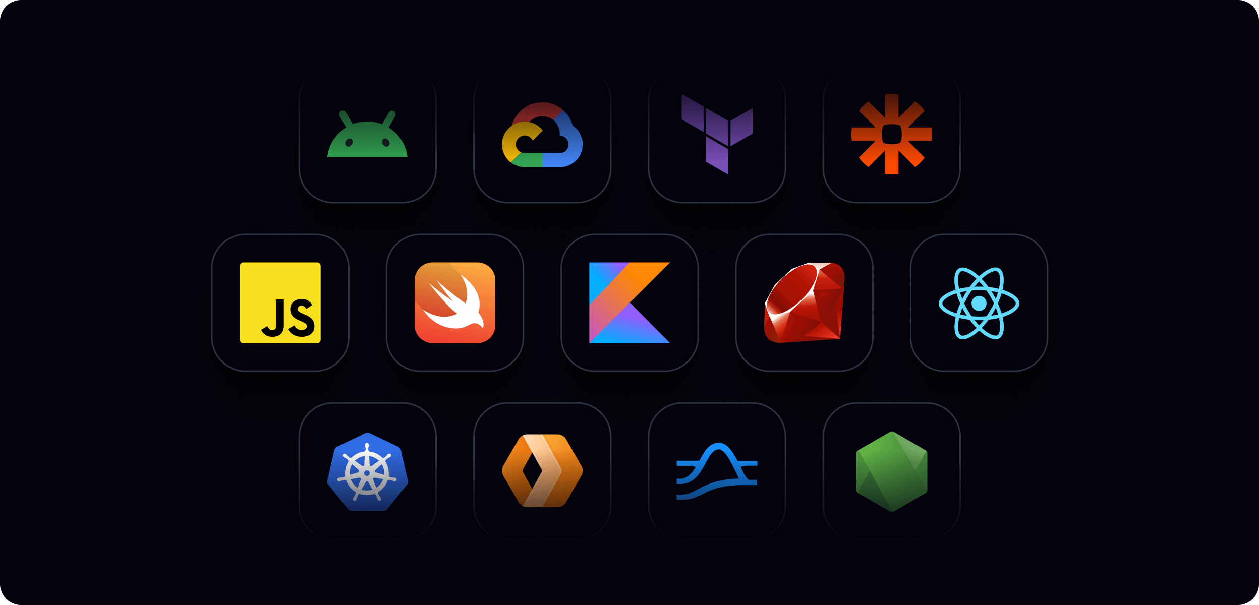
Icon Badges — Technology and framework logos (e.g. Python, React, JavaScript, Kotlin, Swift) presented in dark rounded-square containers. Used to signal SDK availability and technical ecosystem breadth. Consistent sizing and treatment across all contexts.
Data Sparks — Implied motion and data flow through directional line treatments with glowing tips, suggesting live data in transit rather than static state.
Typography in visuals
Display and heading text is set in Manrope Bold at generous sizes with tight letter-spacing. White on dark is the default. Orange is used for overline labels (product names, category markers) set in JetBrains Mono uppercase with wide letter-spacing. Body and supporting text uses Manrope Medium in neutral greys. Metric values (2T+, 550B+, 99.999%) are set large in Ably Orange — these are the proof points that anchor credibility.
What to avoid
- Defaulting to light backgrounds without a considered reason — dark is the starting point for any new composition
- Orange used as a background fill or to flood large surface areas
- More than one secondary accent colour in a single composition
- Decorative gradients on UI elements or feature components
- Busy or cluttered layouts — generous whitespace is non-negotiable
- Generic stock imagery or photography in technical contexts
- Mixing dark brand and light UI aesthetics without intention — when done deliberately the contrast can be highly effective, but it should always be a considered compositional choice
Visual building blocks
Ably's visual language draws on a range of graphic building blocks to construct illustrations, compositions, and backgrounds. The elements below are the most commonly used — they form the core vocabulary that most compositions are built from.
The visual system is modular — there's no expectation that every composition uses all elements. Use what serves the purpose of the visual.
Compositions are built in layers. Understanding which elements belong in which layer helps maintain visual coherence and depth:
- Background layer — sets the scene, establishes mood and product context
- Mid-ground layer — structures the composition and conveys the core visual narrative
- Foreground layer — highlights the specific feature, moment, or detail being communicated
1. Background layer
Glows

Glows are soft, ambient light effects that add depth and atmosphere to a composition. They create a sense of warmth, energy, and dimensionality without competing with foreground content.
How they're used:
- Behind product visuals and hero compositions to create a sense of depth
- To establish product category colour associations (see colour application by context)
- As a visual cue to subtly emphasise an area of a composition
Colour: Follows product category theming — pink for data primitives, blue for app services, green for data services, violet for AI services. Orange for general Ably brand moments.
Application: Always blurred and soft-edged. Intensity is controlled by selecting from lighter or darker values within the relevant colour ramp — lighter values for more prominent glows, darker values for more receded ones. Glows should never be sharp-edged or dominant — they exist in the background, not the foreground.
Brand patterns
Brand patterns are geometric background treatments derived from the Ably symbol. They add texture, depth, and brand presence to a composition without competing with foreground content. All patterns are available in the full secondary colour palette as well as the primary orange.
Pattern themes
Four themes are available, each carrying a distinct narrative. Choose the theme that best supports the message of the composition.
Motion
Conveys energy and movement. Use for compositions that emphasise Ably's dynamic, realtime capabilities — speed, immediacy, and responsiveness.

Scale
Represents growth and expansion. Use for compositions that highlight Ably's ability to handle increasing demand and operate at significant scale.

Integrations
Represents connectivity and seamless integration. Use for compositions that emphasise Ably's strength in connecting and synchronising systems and platforms.

Generic
A versatile pattern that adds a subtle brand presence without a specific narrative. Suitable for a wide range of contexts where a more neutral background treatment is needed.
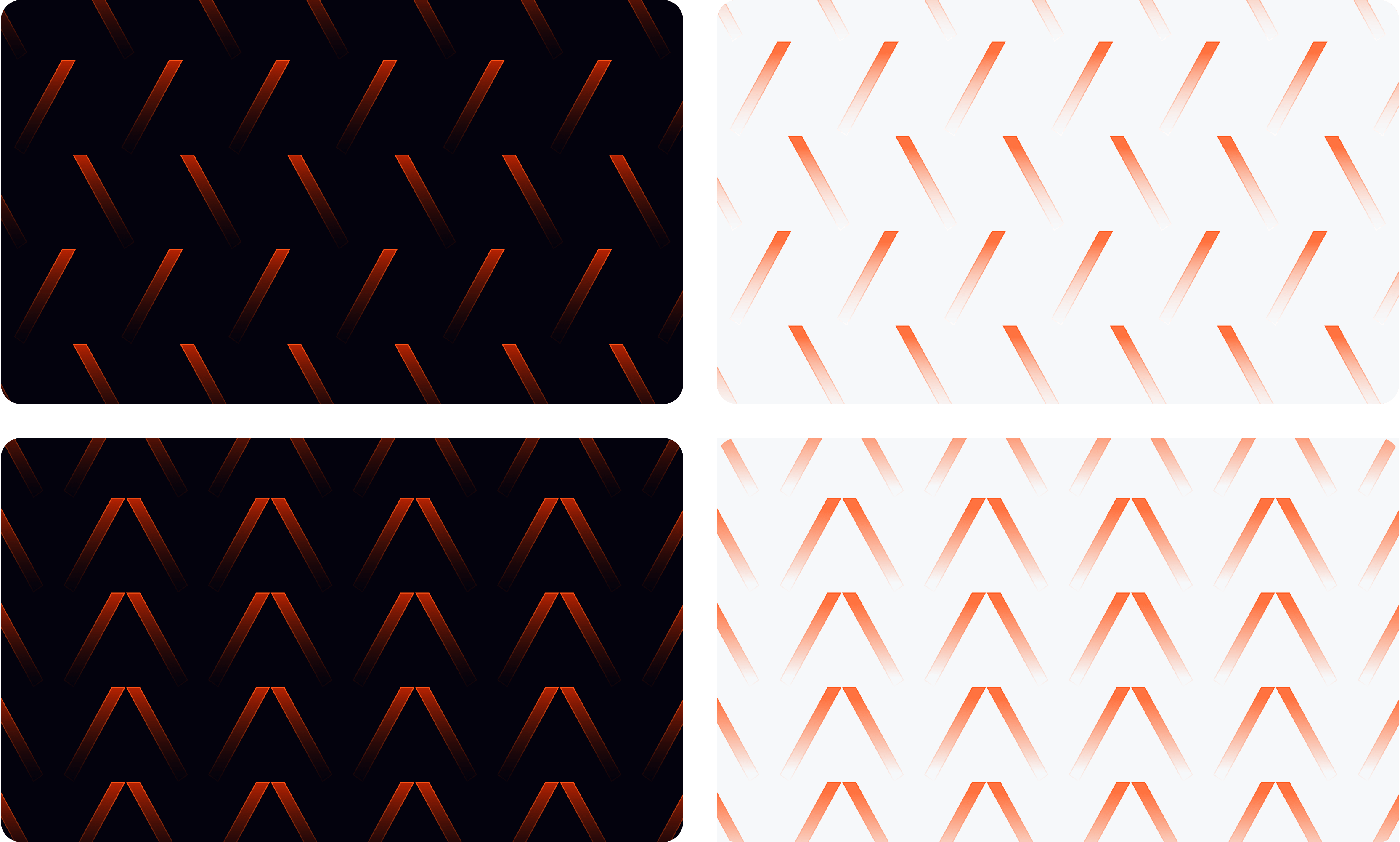
Treatments
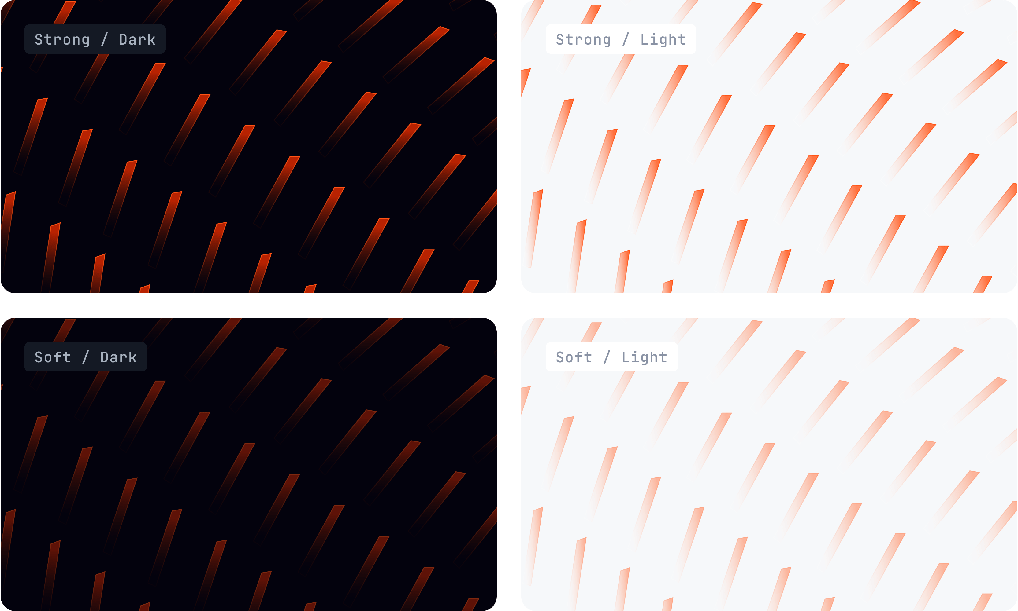
Each pattern is available in two optical strengths, across both dark and light themes:
| Strength | Usage |
|---|---|
| Strong | For compositions where the pattern is the dominant visual — few or no other elements alongside copy. The pattern carries the visual weight. |
| Soft | For compositions where other elements are present in the foreground or mid-ground. The pattern recedes to support without competing. |
Choose the strength that maintains the right balance for the overall composition — patterns should support the foreground, not compete with it.
Optional enhancements
Three optional treatments can be applied to any pattern to add further depth and refinement:
Edge blur — Progressive blur applied to any edge of the pattern, creating a sense of depth and motion. Use the Figma Progressive Blur plugin to generate these.
Pattern fade — A linear gradient placed over the pattern (and any glows) to fade out any area as needed. Multiple fades can be applied to different areas of the same pattern.
Glows — Colour glows placed in front of the pattern to highlight specific areas. Typically use the same colour group as the pattern, but can be flexible. Multiple glows can be used to draw attention to different parts of the composition.
2. Mid-ground layer
Containers

Containers encapsulate content, providing structure and focus within a composition. They create visual hierarchy, separate layers of information, and give Ably's designs a sense of crafted, modular precision — intentionally mirroring the composable, layered nature of the platform architecture itself.
How they're used:
- As encapsulation elements that group and isolate content — UI mockups, code snippets, metric data, system representations
- As shaded surfaces that create visual separation and layering within a composition
Styles:
- Frosted glass — Semi-transparent surface with a subtle border. Used for UI overlays and floating card elements.
- Gradient stroke — Solid fill with a colour-matched gradient border. Used for product and feature highlights.
- Solid — Opaque surface with a subtle border. Used for icon badges and metric cards.
These styles apply across both dark and light theme contexts — the surface values adapt to the theme while the structural approach remains consistent.
Shape: Corner radius is proportionate to the size of the container rather than fixed. For square icon-style containers, the formula is corner-radius = 2 × round((size ÷ 3.25) ÷ 2). For larger card and surface containers, radius should be visually calibrated to feel consistently rounded without being circular. Never hard-edged. Generous internal padding.
User experience context
The mid-ground often includes the app or product UI that sets the scene for the composition — showing the end-user experience that Ably powers. This might be a chat interface, a collaborative document, a live data feed, or a code snippet. It establishes context before the foreground pulls out the specific moment or feature being highlighted.
Connectivity
Connectivity elements symbolise the linking and interaction of data, systems, and people. They make visible the relationships and interactions that Ably enables — between services, between devices, between users.
How they're used:
- To show system architecture and data flow relationships
- To illustrate multi-party interactions (presence, collaboration, agent orchestration)
- As structural scaffolding in feature and example visuals
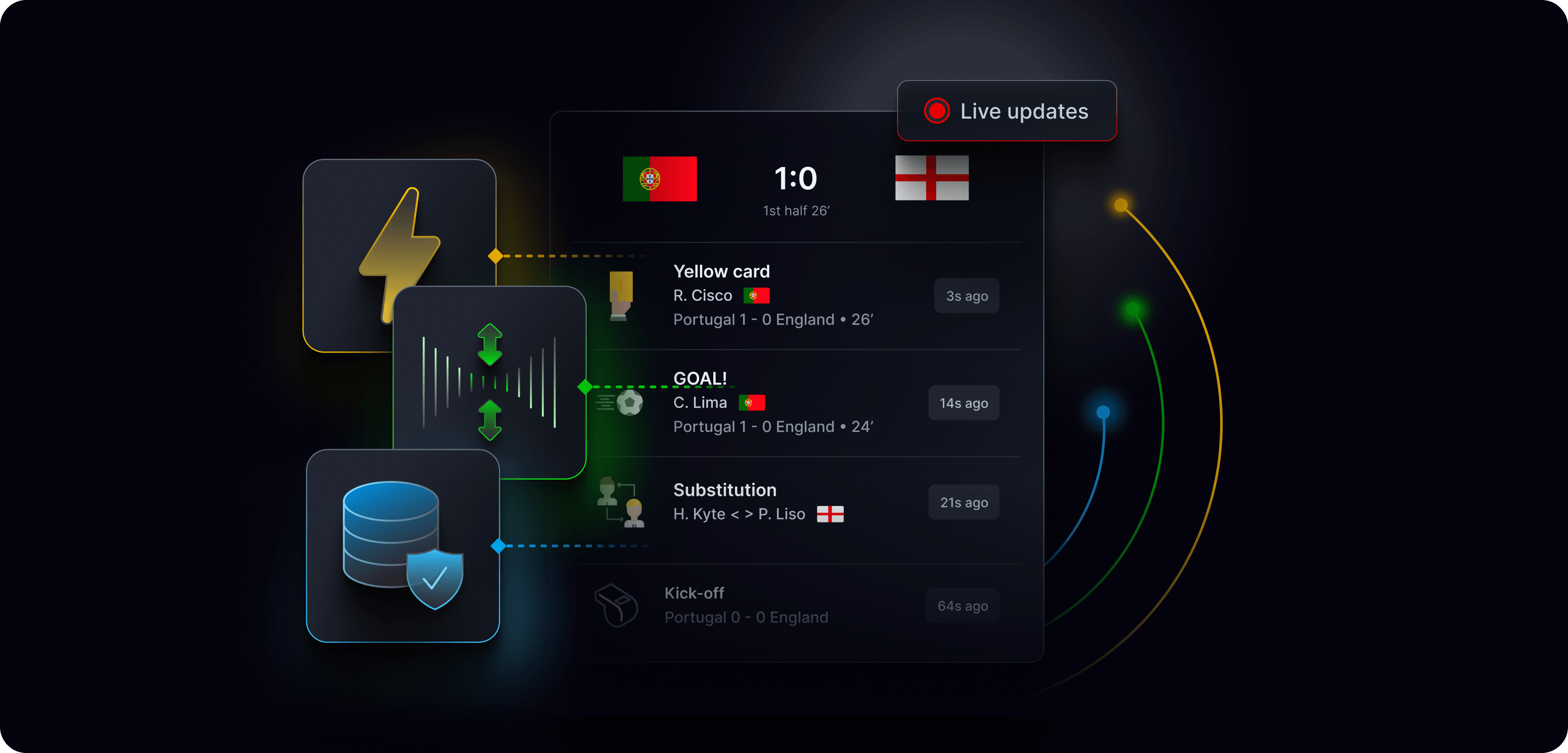
Aesthetic: Stylised lines with node connectors — dots, diamonds, or small icons mark the connection points. Lines favour a right-angled routing style with rounded corners — clean 90° turns rather than diagonal or freeform curves. Orange (or product colour-matched) marks active Ably connection points; neutral grey for supporting or inactive relationships.
Note: Connectivity and data sparks are related but distinct — connectivity shows the relationship between things, data sparks show the data moving along those relationships.
Data sparks
Data sparks represent the flow and movement of data — the seamless, continuous transmission of information that Ably makes possible. They suggest something live, in transit, and always on.
How they're used:
- To illustrate data moving between systems, services, or devices
- To reinforce the realtime nature of Ably's infrastructure
- As directional elements that guide the eye through a composition
Aesthetic: Stylised directional lines with glowing tips — the fading tail conveys momentum and motion, while the glowing tip represents intensity and the data point itself.
Colour: Typically follows the product category or context. Orange data sparks are used when highlighting Ably's specific role in a data flow.
3. Foreground layer
Icon badges
Technology and framework logos (e.g. Python, React, JavaScript, Kotlin, Swift) presented in dark rounded-square containers. Used to signal SDK availability and technical ecosystem breadth. Consistent sizing and treatment across all contexts.
Shape: Follows the same proportionate corner radius formula as containers: corner-radius = 2 × round((size ÷ 3.25) ÷ 2).
UI element pull-outs
Specific UI elements or moments lifted from the mid-ground user experience context and brought into the foreground to highlight a particular feature or capability powered by Ably. These are the most visually prominent elements in a composition — they tell the specific story that the background and mid-ground have set up.
Using elements in combination
No single element should dominate. The interplay between them — depth, structure, relationship, motion — is what creates the sense of a live, sophisticated infrastructure system.
For a fuller range of compositions showing the visual building blocks working together in context, see references/experiential-and-use-case.md.
For guidance on how these elements are applied in specific executional contexts, see:
Icons
Ably uses two distinct icon tiers — GUI icons for functional interface navigation, and display icons for visual storytelling and richer compositional contexts. Each tier has its own style, usage rules, and variant set.
GUI icons
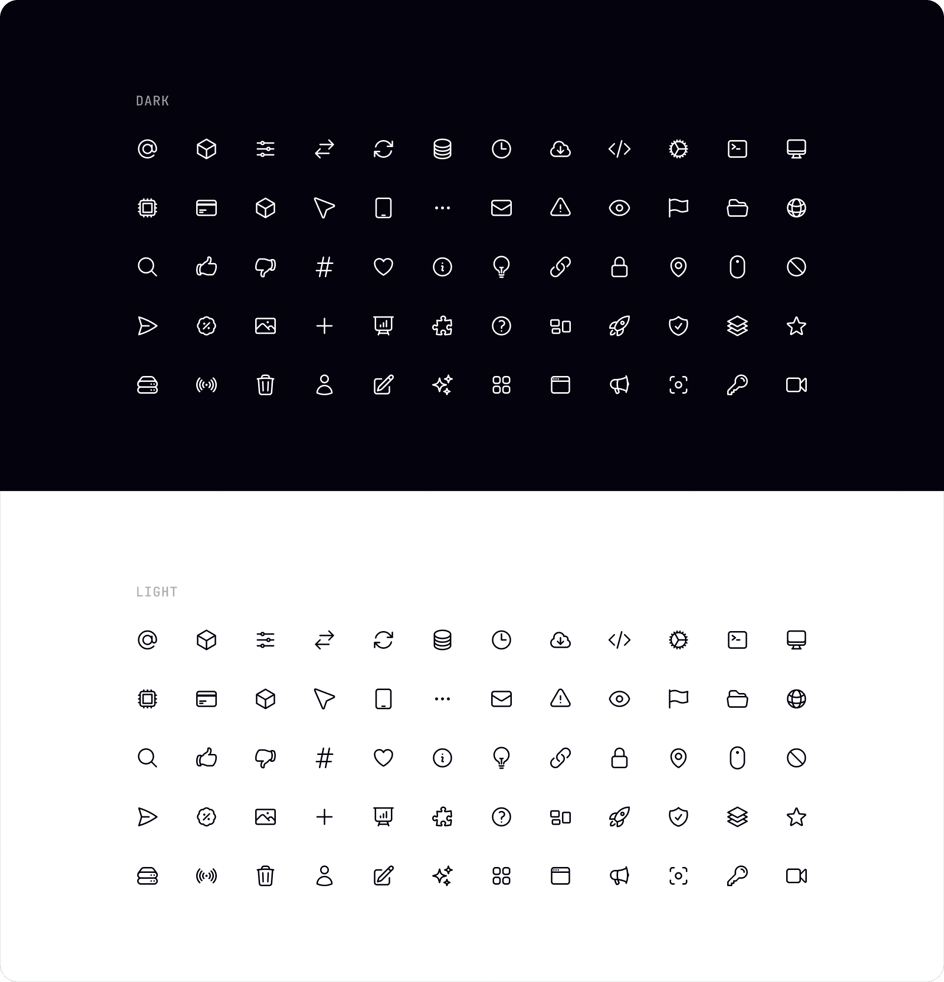
GUI icons guide users and support navigation across Ably's digital interfaces. They are simple, clear, and functional — designed to be immediately recognisable and work consistently at small sizes.
Base library: Heroicons — used as the primary source. Custom icons are added where Heroicons doesn't cover a specific need.
Style: Outline stroke is the preferred style. Fill variants are acceptable for specific, small UI usage where outline lacks sufficient visual weight at size.
Colour: In UI design, icon colour routinely matches the accompanying text or UI label colour to maintain visual consistency within a component.
Themes: Available in dark and light variants. Use the appropriate variant for the interface context.
Usage: Navigation, actions, status indicators, form controls, and functional UI contexts. GUI icons can also be used as visual cues in content contexts — for example, within content tiles and cards — where they support scannability and comprehension.
Display icons
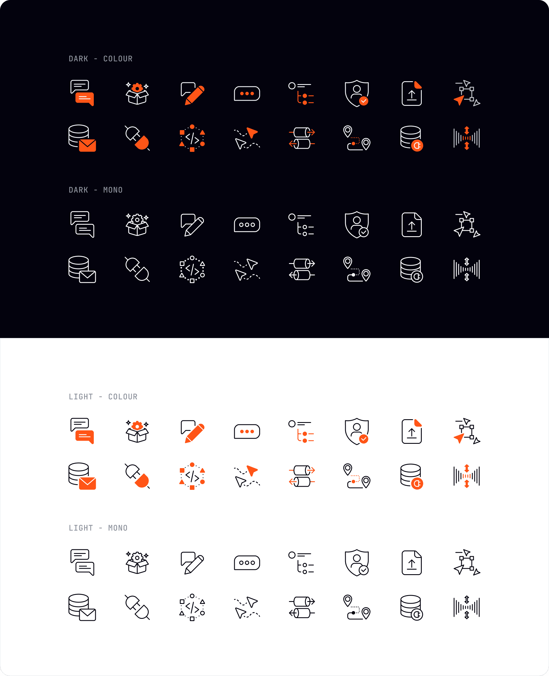
Display icons are a fully custom set designed to convey more complex, realtime-specific concepts. They are more detailed and visually expressive than GUI icons, and are used to enrich visual storytelling in compositions, marketing materials, documentation, and product pages.
Style: Stroke-based with consistent weight. More detail and visual complexity than GUI icons, while remaining clean and legible. Colour variants are preferred over mono where the context supports it — they add visual richness and reinforce brand presence.
Size range: 32px–64px.
Variants: Four variants are available for every icon:
| Variant | Description |
|---|---|
| Dark — mono | White stroke on dark background. No colour fill. |
| Dark — colour | White stroke with orange accent fills on dark background. |
| Light — mono | Dark stroke on light background. No colour fill. |
| Light — colour | Dark stroke with orange accent fills on light background. |
Usage: Compositions, feature cards, product pages, blog imagery, documentation illustrations. Display icons should never be used in functional UI contexts — use GUI icons for navigation and actions.
📦 The full display icon library is available on the Ably brand asset portal.
Icon encapsulation
Icons can be presented with or without an encapsulating container depending on context. The key distinction is between decorative and functional usage — decorative icons use a borderless background fill, functional icons add a 1px border to signal interactivity.
📐 For full encapsulation guidelines including container padding, anatomy diagrams, and usage examples across light and dark themes, see the icon encapsulation guidelines in Figma.
Corner radius formula
To keep icon containers visually consistent and balanced across different sizes, corner radius is calculated proportionally using the following formula:
corner-radius = 2 × round((size ÷ 3.25) ÷ 2)
In practice: divide the longest edge of the container by 3.25, round to the nearest 2px.
Reference table
View full corner radius reference table
| Square size (px) | Corner radius (px) |
|---|---|
| 16 | 4 |
| 20 | 6 |
| 24 | 8 |
| 28 | 8 |
| 32 | 10 |
| 36 | 10 |
| 40 | 12 |
| 44 | 14 |
| 48 | 14 |
| 52 | 16 |
| 56 | 18 |
| 60 | 18 |
| 64 | 20 |
| 72 | 22 |
| 80 | 24 |
| 88 | 26 |
| 96 | 28 |
| 104 | 32 |
| 112 | 34 |
| 120 | 36 |
| 128 | 38 |
| 144 | 44 |
What to avoid
- Using display icons in functional UI contexts
- Mixing icon tiers within a single composition
- Applying borders to decorative icon encapsulations
- Using colour variants of GUI icons where mono is more appropriate — colour should be purposeful, not default
- Resizing icons outside the defined size steps without recalculating the corner radius
Experiential and use case visuals
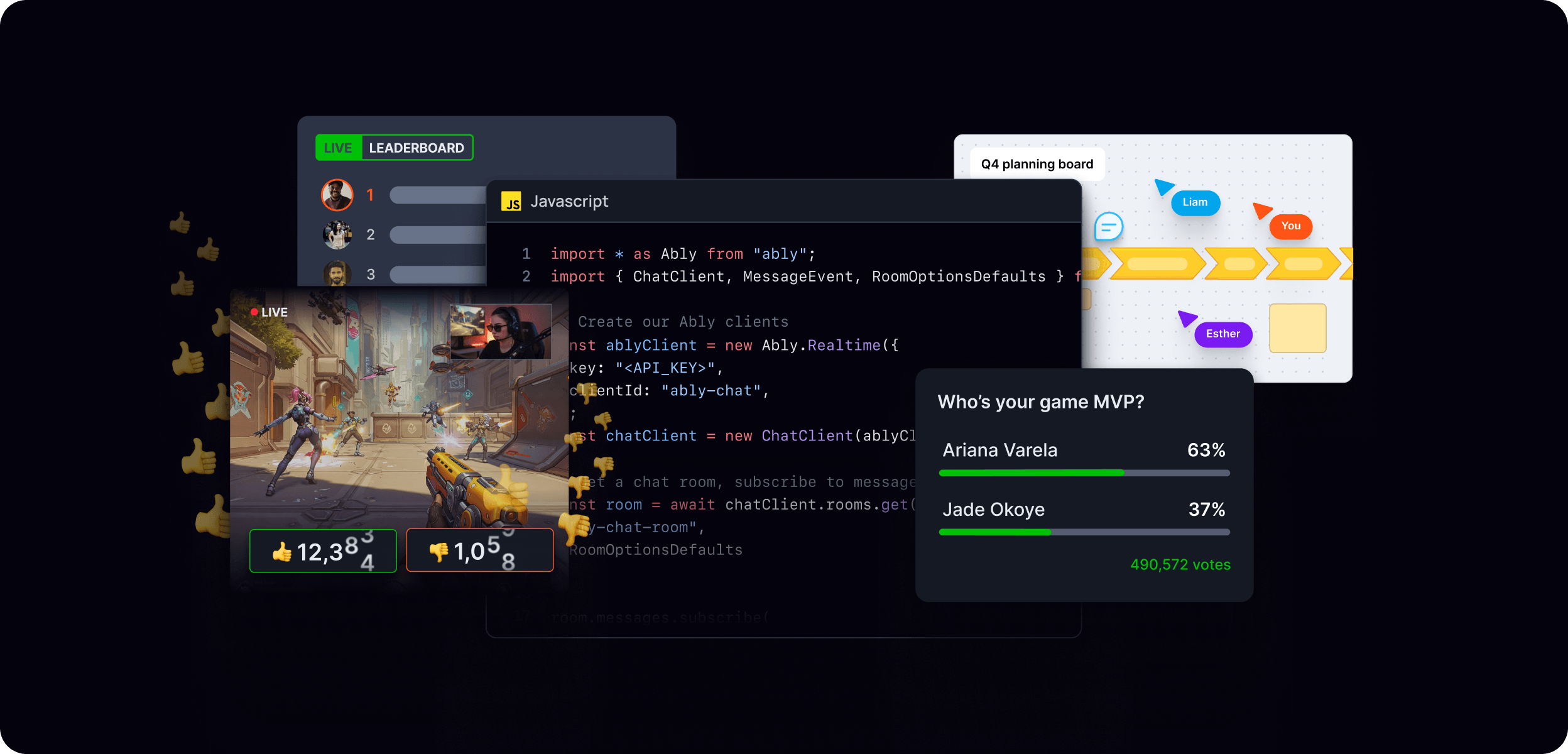
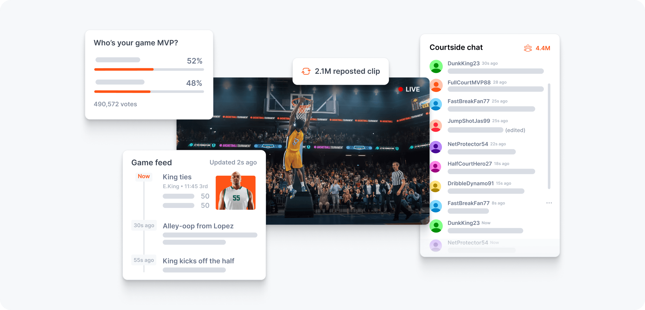
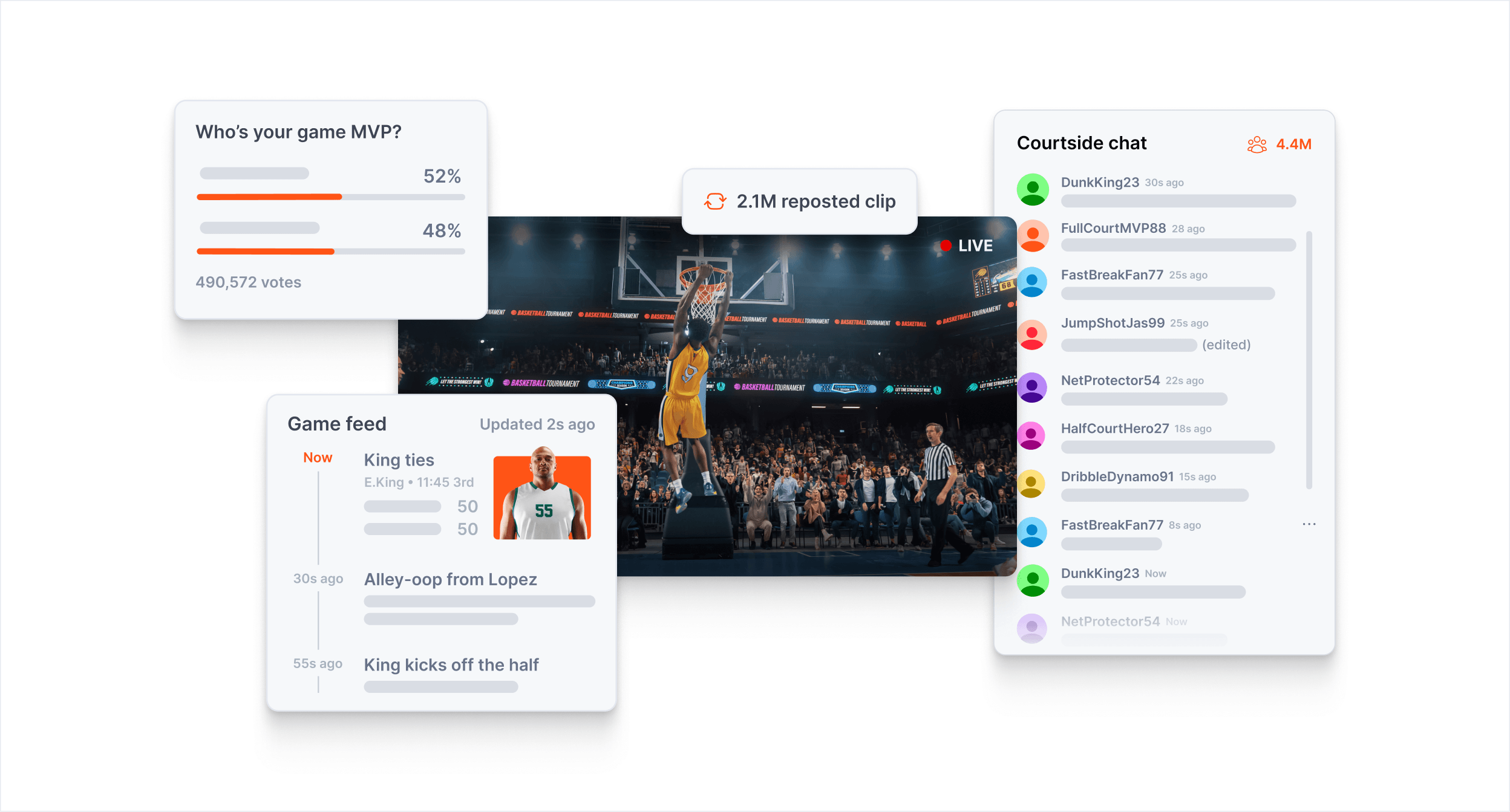
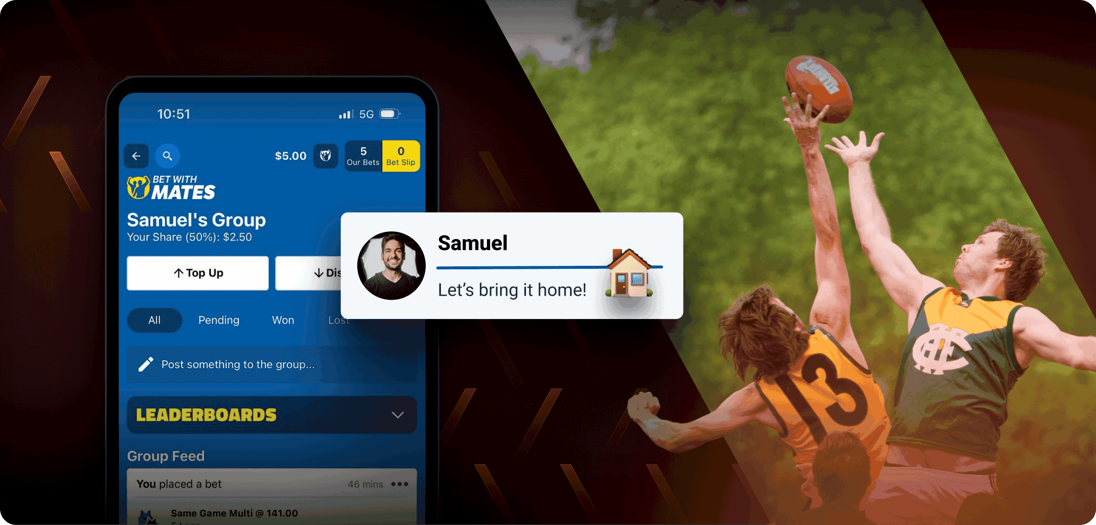
Experiential and use case visuals are Ably's richest, most detailed compositions. They show what the end user actually sees and experiences — real UI, real interactions, real outcomes — grounded in authentic product contexts. Where feature visuals focus on the mechanism, experiential visuals focus on the moment: what it feels like to use a product powered by Ably.
These visuals are used primarily in product hero sections and campaign contexts, where the goal is to make the capability feel tangible and desirable to a technical audience evaluating whether to build with Ably.
Principles
Show the experience, not just the infrastructure. The visual centrepiece is the end-user product — chat interfaces, collaborative tools, live data feeds, AI assistants, gaming experiences. Ably's role is present but not dominant.
Make it real. Fictional but believable UI, realistic data, plausible user names and interactions. Avoid placeholder copy like "Lorem ipsum" or generic UI that signals inauthenticity.
Dark by default. The canonical background is the near-black with a subtle cool tint, with product category colour glows establishing context. Light treatments are used occasionally where the product context calls for it.
Layer deliberately. These compositions make full use of the visual building block system — background glows and patterns, mid-ground UI context and containers, foreground pull-outs and icon badges. See references/visual-building-blocks.md for the full layering system.
Product category theming
Experiential visuals follow the product category colour system for background glows and accents:
| Category | Colour | Products |
|---|---|---|
| Data primitives | Pink | Pub/Sub |
| App services | Blue | Spaces, Chat |
| Data services | Green | LiveObjects, LiveSync |
| AI services | Violet | AI Transport |
Composition structure
A typical experiential composition is built in three layers:
Background — Near-black with a product-coloured ambient glow. A brand pattern may be added for additional texture, typically at soft strength to avoid competing with the mid-ground.
Mid-ground — The primary UI experience, set in a realistic product context. This might be a chat room with live users, a collaborative document with presence cursors, a live leaderboard, or an AI assistant conversation. Technology icon badges float alongside the UI, signalling the developer ecosystem.
Foreground — Pull-outs that highlight specific moments or features — a notification, a live count, a presence indicator, a code snippet showing how the feature is implemented. These are the elements that tell the specific story.
Use case examples
Real-time chat and messaging
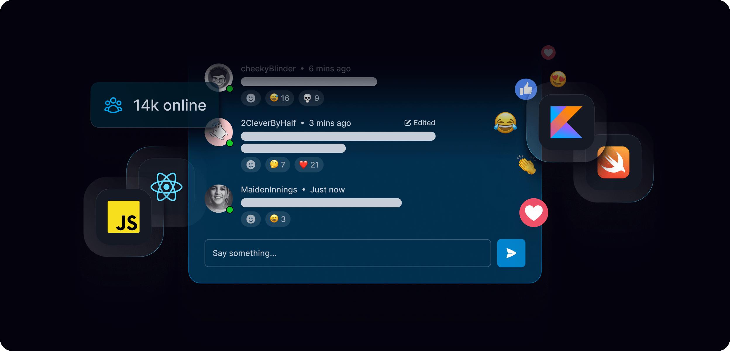
Live chat interfaces with presence indicators, typing states, reaction counts, and message threading. Floating technology badges signal framework support. Metric row anchors the composition in scale proof points.
Live collaboration
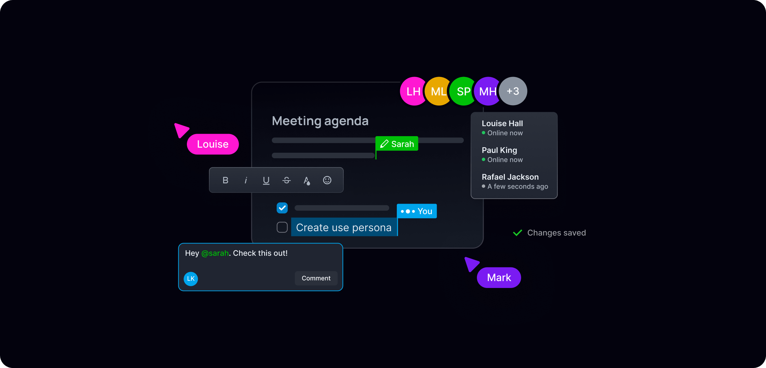
Collaborative document or whiteboard experiences showing multiple users working simultaneously — presence cursors, live editing, user avatars with location labels. Spaces product theming (blue).
Live data and scoring
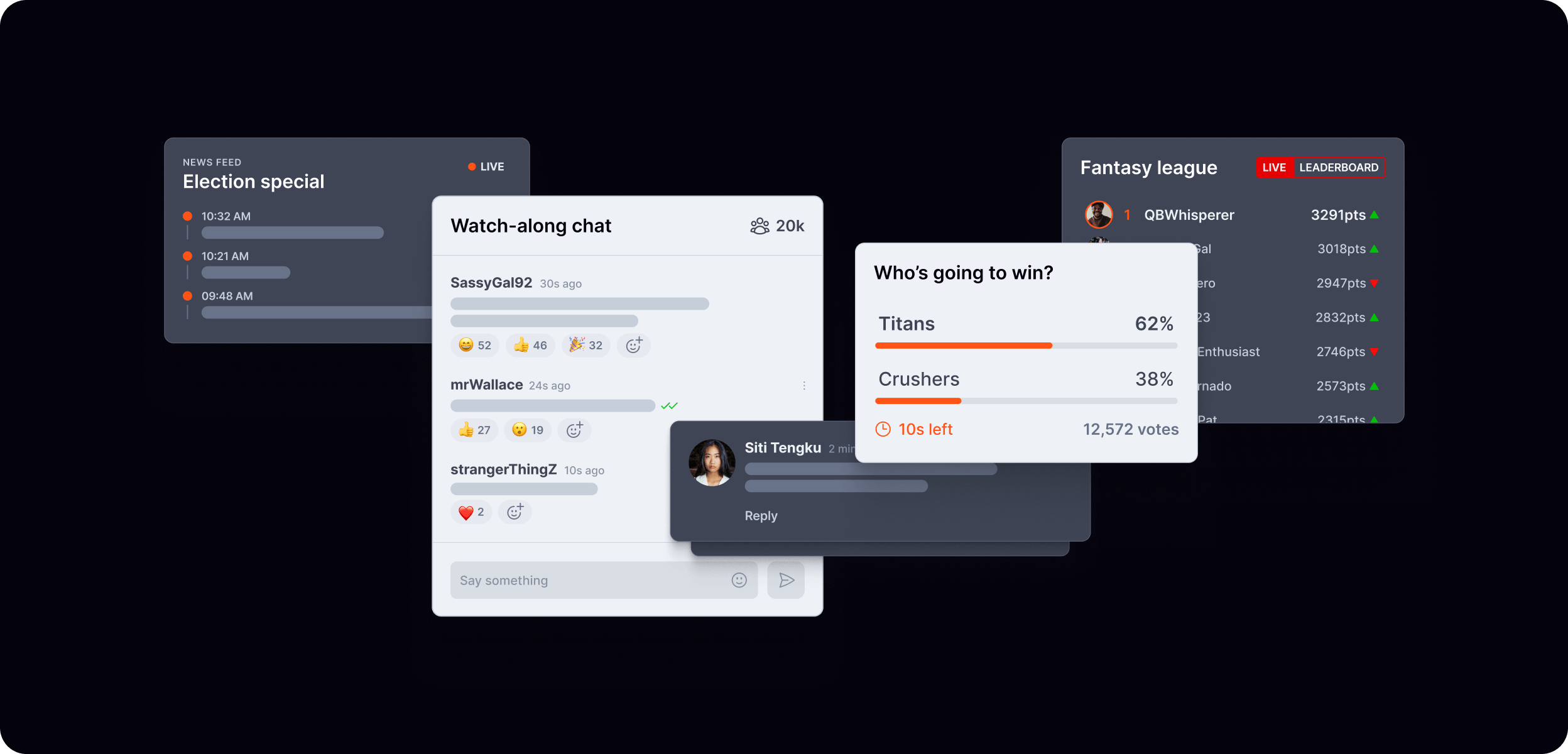
Real-time leaderboards, scoreboards, voting interfaces, and live statistics. Dynamic data states — updating values, trend indicators, live poll results. Product UI layered with data context.
AI agent experiences
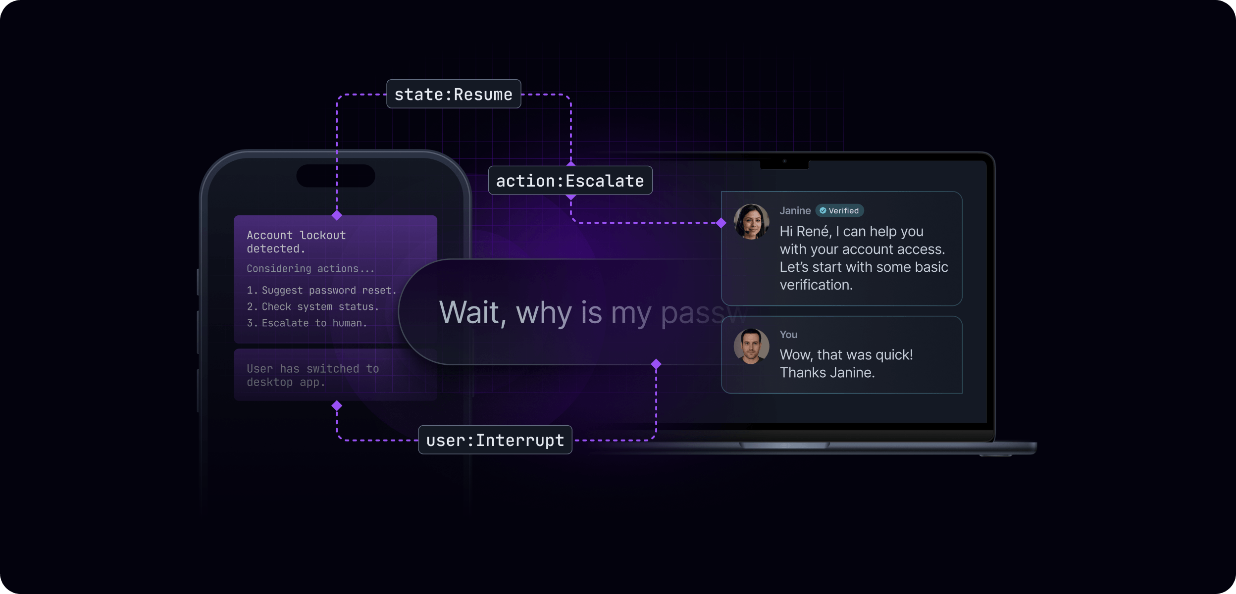
AI assistant conversations, agent orchestration flows, multi-device continuity scenarios. Violet product theming. Dashed connectivity lines show agent relationships and data flow. State labels (state:Resume, action:Escalate, user:Interrupt) surface the infrastructure layer.
Database and data sync
E-commerce product pages, stock tickers, or application dashboards showing live data synchronisation across multiple devices. Green product theming. Multiple device frames at different scales suggest cross-platform reach.
Light theme treatments
Light theme experiential visuals follow the same compositional principles but use white or near-white backgrounds with the neutral scale. They are used when the product context is inherently light — consumer-facing apps, editorial contexts, or in-article usage where legibility takes priority. The same layering system applies; colours, typography, and composition principles remain consistent with the dark theme.
What to avoid
- Generic or implausible UI — interfaces should look like real products
- Orange used as a background or large-area fill in these compositions
- Overcrowded compositions — generous whitespace allows the experience to breathe
- Mixing product category colours without a clear reason
- Static-feeling designs — live indicators, timestamps, and dynamic data states reinforce the realtime narrative
Features and examples
Feature and example visuals are paired-back compositions that focus on the purpose of a specific capability. Where experiential visuals show the full end-user experience, feature and example visuals zoom in on the mechanism — orientating a technical audience quickly and clearly around the individual methods of building realtime.
These visuals are used across documentation, product pages, blog posts, and the examples library. They are designed to be clear and functional first, with visual polish applied in proportion to the context.
Principles
Focus on the mechanism. Strip back everything that isn't essential to communicating the specific feature or capability. One idea per composition.
Ably's role is always visible. Orange accents mark Ably's connection points, data flows, or SDK interactions. Even in a minimal composition, the viewer should be able to identify where Ably sits in the system.
Theme follows context. Dark theme for marketing and product contexts. Light theme for documentation, in-article usage, and example UI components. Both are valid — apply consistently within a given context.
Keep it modular. Each visual should work independently. Avoid compositions that only make sense when viewed alongside other visuals.
Visual types
Features
Feature visuals focus on a specific Ably capability — showing the mechanism, the data flow, or the system interaction in a clear, diagrammatic style. Ably's role is always identifiable through orange accents or an icon badge.
📐 For the full features styling guide, see the features Figma file.
- Chat rooms
- Polls & quizzes
- Moderation
- Typing indicators
- Authentication
- Status
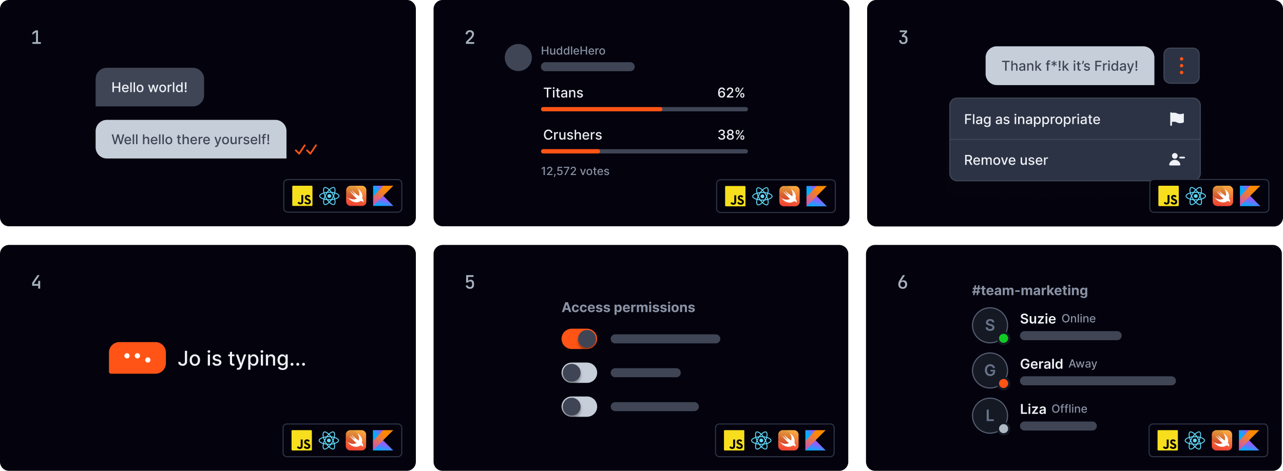
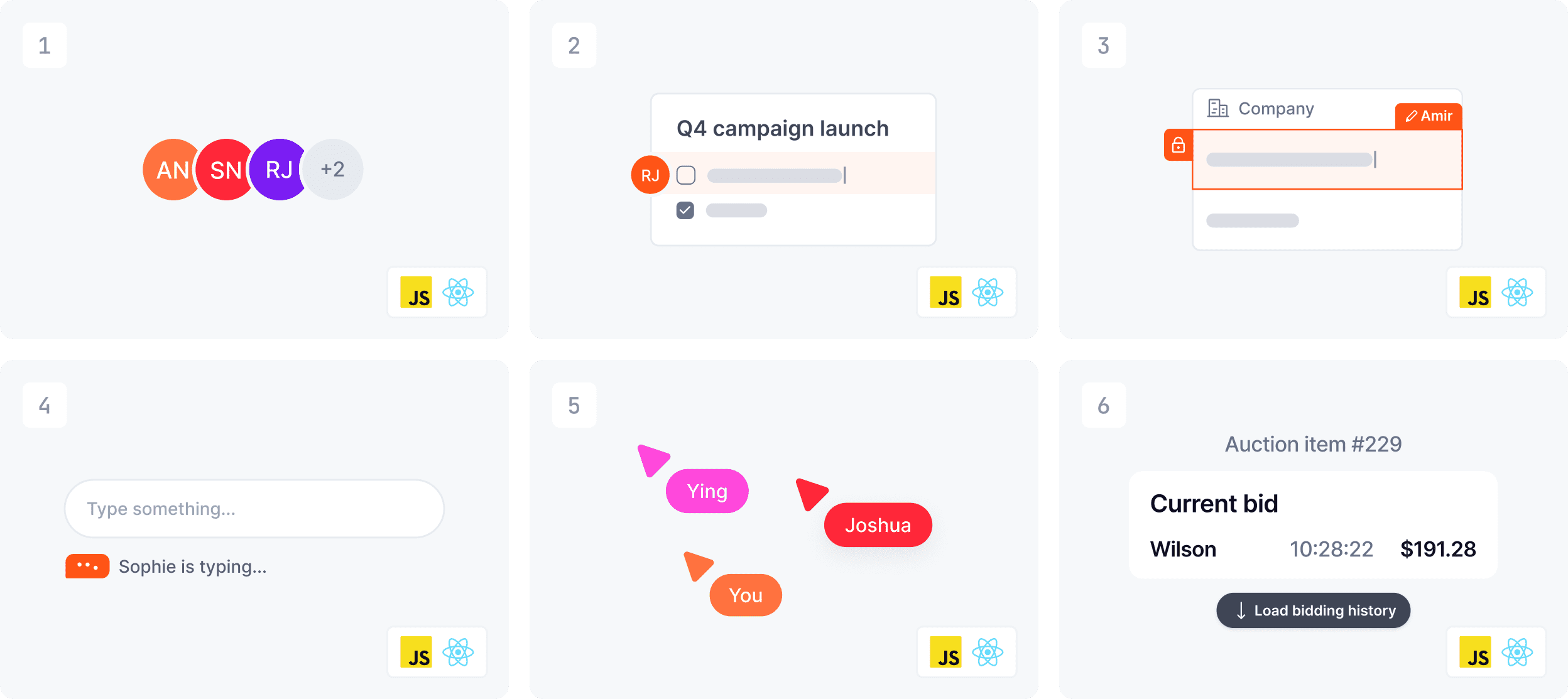
Examples
Example visuals show a specific implementation in context — a UI component or an interaction state. They are designed for maximum legibility and work equally well at thumbnail and full size. Light theme by default.
📐 For the full examples styling guide, see the examples Figma file.
- Avatar stack
- Member location
- Component locking
- Typing indicator
- Live cursors
- History
Colour and theme guidance
| Context | Theme | Background |
|---|---|---|
| Product pages, marketing | Dark | Ably black with product glow |
| Documentation | Light or dark | Follows doc site theme |
| Example library | Light or dark | Follows doc site theme |
| Blog in-article | Light | White |
What to avoid
- Overcomplicated compositions — one idea per visual
- Missing Ably presence — always make Ably's role identifiable
- Inconsistent theme within a single context — pick dark or light and apply consistently
- Overdecorating with shadows, elevation, or visual effects — these visuals are intentionally flat and clean
- Placeholder or lorem ipsum copy in UI mockups — use realistic content
Blog
Ably blog visuals serve two distinct purposes — lead imagery that represents the post in listings and social sharing, and in-article imagery that supports the written content. Each has its own approach, though both draw from the same underlying visual language.
Lead images
Lead images are the primary visual for each blog post — appearing in the blog listing, at the top of the article, and as the social share preview. They need to work at multiple sizes and communicate the subject quickly.
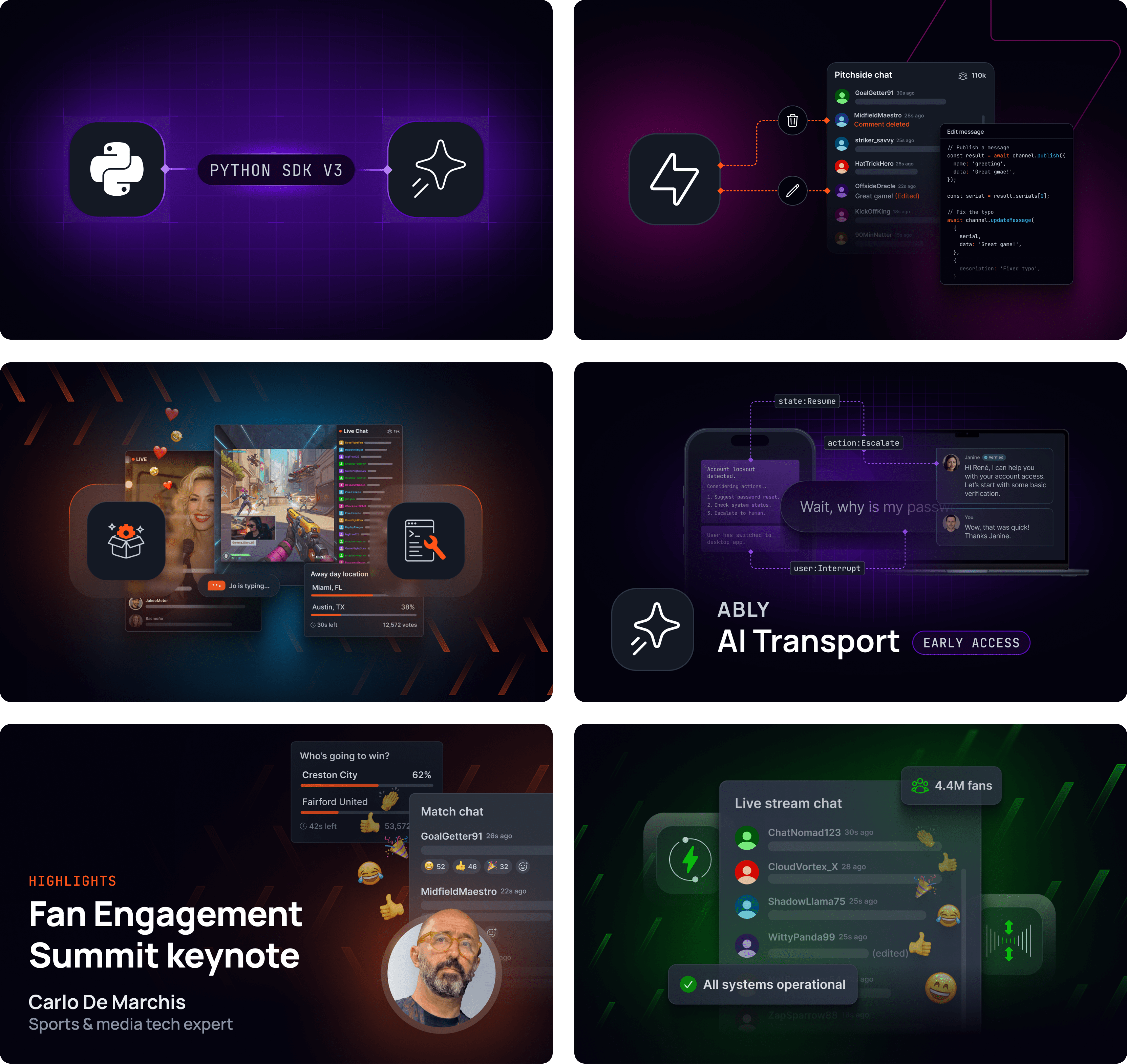
Typical approaches
Lead images are crafted compositions that connect Ably's visual language to the subject matter of the article. The range of approaches is broad — the right choice depends on the topic, the product context, and the intended audience.
Icon badge compositions — technology or framework logos in dark containers, connected by data sparks or connectivity elements, on a dark background with Ably Orange or product category glow.
Product UI + brand elements — product UI mockups layered with brand elements, showing the end-user experience in context. Often incorporates photography for fan engagement, sports, or consumer-facing use cases.
Photography composite — photographic imagery of people, events, or real-world contexts integrated with brand elements and overlaid text treatments. Effective for speaker series, case studies, industry trend pieces, and human-interest stories.
Typographic + brand — bold typographic treatment on a dark background with brand pattern, glow, and logo. Effective for thought leadership, company news, values-led content, and roundup articles where the message is the centrepiece.
Abstract brand composition — brand elements (data sparks, connectivity, glows) combined with abstract visual metaphors — speed dials, waveforms, data flows — to evoke a concept without showing literal product UI. Effective for engineering deep dives and technical thought leadership.
Conventions
- Dark theme by default. Lead images follow the dark brand aesthetic. Light treatments are rare.
- Product category theming. Product-specific posts use the relevant category colour for glow and accent elements.
- No body copy in lead images. Article titles and metadata are handled by the CMS. Lead images may include short labels or overlines (e.g. "NEW FEATURE", "INTRODUCING", "SPEAKER SERIES") but should not reproduce the full article title.
- Consistent crop. Lead images are produced at a 16:9 aspect ratio to ensure consistent display across the blog listing and social previews.
In-article imagery
In-article visuals support the written content — clarifying concepts, showing mechanisms, and adding visual interest within the flow of the article. These follow a light theme by default, consistent with the editorial reading context.
In-article visuals typically fall into one of the following formats — for detailed guidance on each, see the relevant reference file:
- System architecture and flow diagrams →
references/diagrams.md - Feature and example visuals →
references/features-and-examples.md - Infographics and data visualisation →
references/infographics-and-data-viz.md
What to avoid
- Reproducing the full article title as body copy in lead images — use short labels or overlines only
- Using light backgrounds for lead images without a clear reason
- Generic or stock-feeling compositions — lead images should feel specific to the article topic
- Inconsistent aspect ratios across a series of related posts
Diagrams
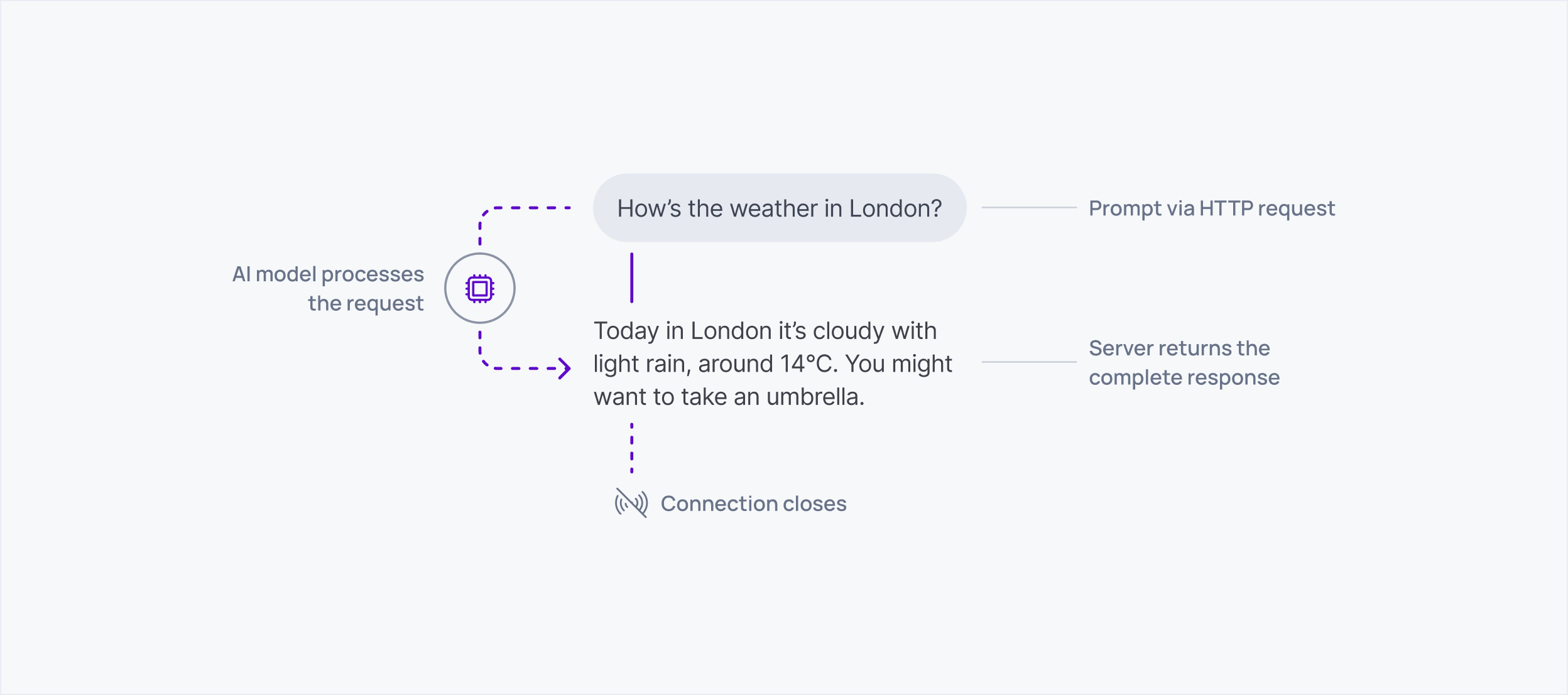
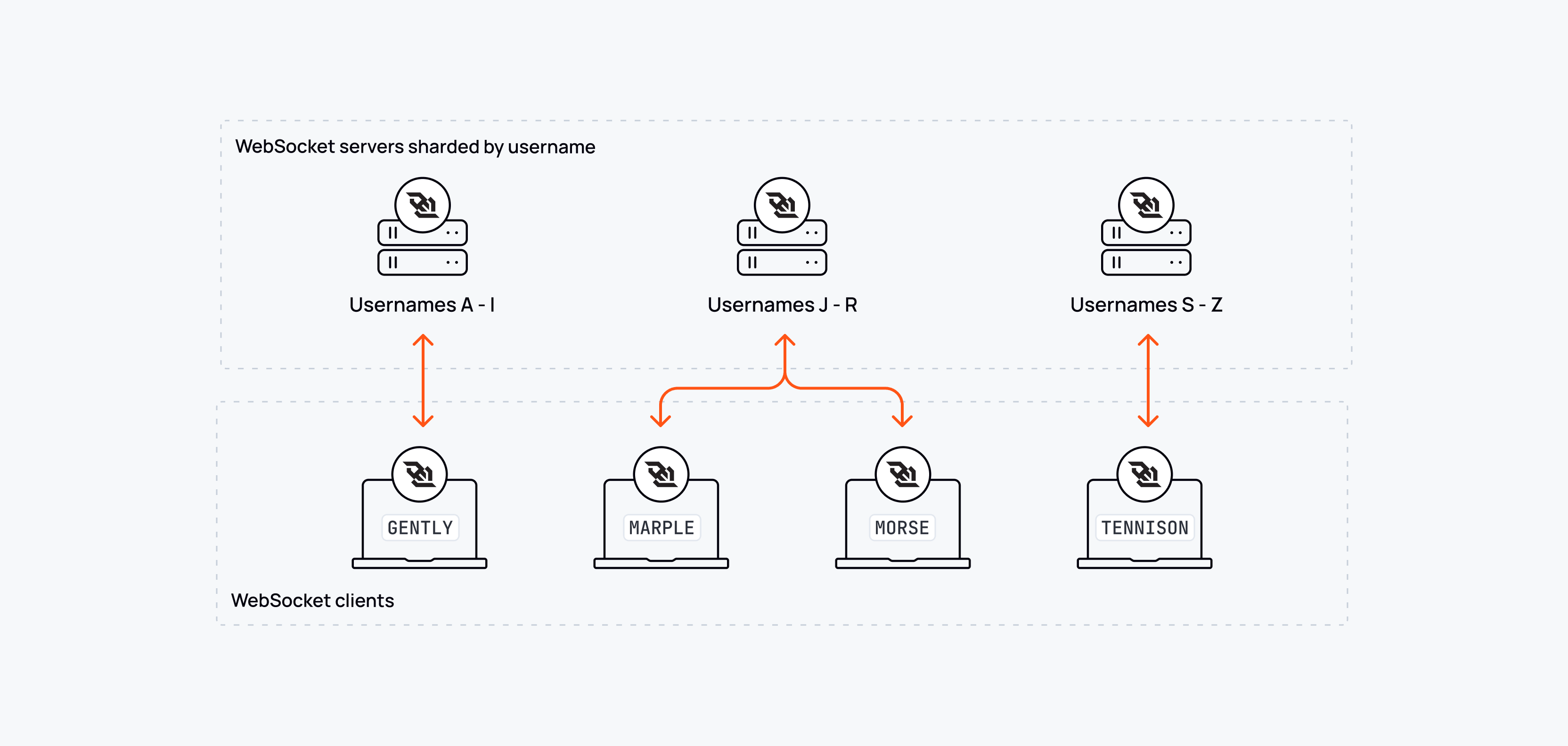
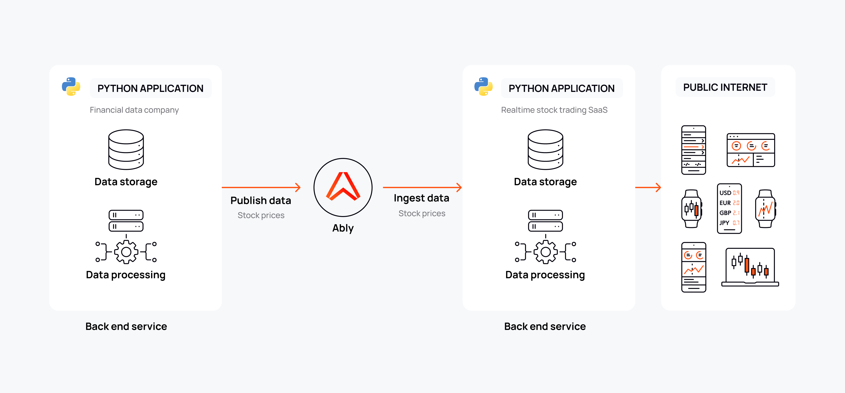
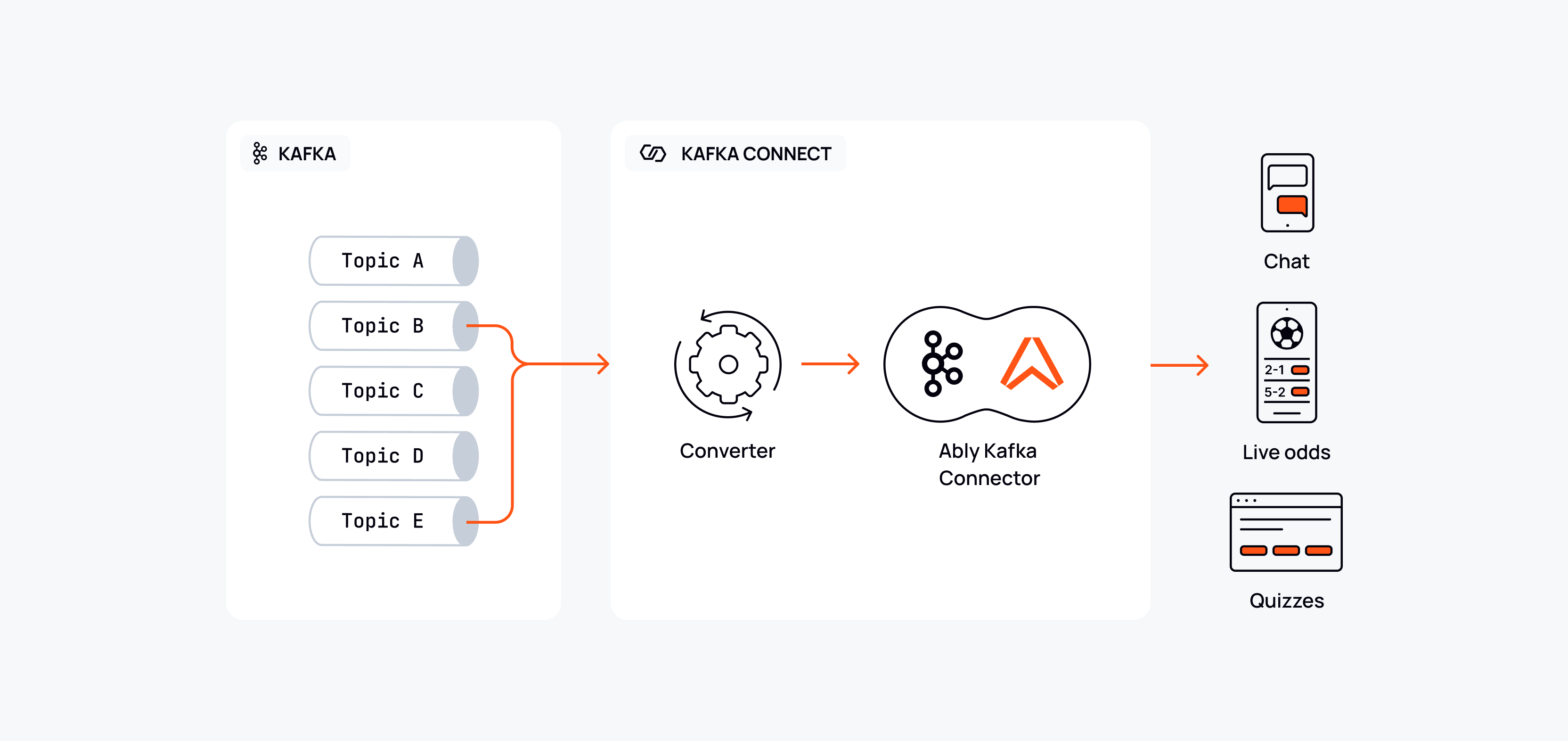
Ably diagrams are built from a single flexible system — a consistent set of objects, connectors, and conventions that can be applied at varying levels of visual treatment depending on the context. The same underlying language appears in technical documentation, blog articles, and marketing materials; what changes is the degree of embellishment, not the foundational approach.
📐 All diagram components are available in the Diagram Object Library v2 in Figma.
The diagram system
Objects
Diagrams are composed from a consistent set of reusable objects:
- Icon nodes — display or GUI icons in circular or rounded-square containers, representing services, systems, clients, or agents
- Labelled objects — simple rounded rectangles with a text label, used for systems, topics, channels, or grouped elements
- Technical zones — larger bounding boxes (solid or dashed border) that encapsulate related elements — e.g. "Your integration", "Private network", "Ably distributed network"
- UI mockups — product UI components embedded within the diagram to show the end-user context, ranging from schematic representations to more detailed renderings depending on the level of treatment
- Data objects — visual representations of data in transit — tokens, messages, batches — used to make abstract flows tangible
Connectors
Connectors show the relationships and flows between objects:
- Solid lines with arrowheads — active, directional data flows. Orange for Ably-managed flows; product category colour for product-specific flows; neutral grey for secondary or contextual flows
- Dashed lines — secondary flows, optional paths, or new capabilities being introduced
- Right-angled routing — connectors favour 90° turns with rounded corners rather than diagonal or freeform curves
- Dot connectors — small filled circles mark branching or joining points in a flow
Labels and annotations
- Flow labels sit above or alongside connectors, in small neutral-grey text
- System labels sit below icon nodes or labelled boxes
- Step numbers (circled numerals) are used when sequence matters
- Zone labels (e.g. "PRIVATE NETWORK", "EDGE MESSAGING LAYER") use uppercase monospace text to delineate architectural boundaries
Levels of treatment
The diagram system supports a spectrum of visual treatment. Choose the level that matches the context and audience.
Clarity-first
Pure line diagrams on a white or light grey background. Outline icons, orange connectors, neutral grey for secondary flows. No elevation, no decorative fills. Maximum information density with minimum visual noise.
Use for: Technical documentation, API references, in-article blog diagrams, internal presentations.
Narrative-enhanced
The same underlying system, but enriched with UI mockups, product context, and more deliberate visual storytelling. Often used to show a before/after state, or to blend the infrastructure layer with the end-user experience. Product category colours introduce visual emphasis on the active or highlighted flow.
Use for: Blog articles, feature pages, product documentation that benefits from contextual grounding.
Embellished
Adds elevation, shadow, colour fills, and additional visual weight to containers and objects. Used sparingly for more prominent marketing moments where the diagram needs to carry more visual impact alongside other brand elements.
Use for: Marketing landing pages and campaign materials. Use sparingly — reserve for contexts where the diagram is a primary visual element rather than supporting content.
Colour conventions
| Element | Colour |
|---|---|
| Ably-managed flows | Orange (#FF5416) |
| Product-specific flows | Product category colour |
| Secondary / contextual flows | Neutral grey |
| New or optional capability flows | Dashed, product category colour |
| Architectural zone backgrounds | Very light neutral fill |
| Active / highlighted state | Product category colour |
What to avoid
- Freeform or diagonal connector routing — favour right-angled paths
- Mixing connector styles without a clear semantic reason
- Overembellishing diagrams intended for documentation contexts
- Using orange for non-Ably flows or elements
- Inconsistent icon styles within a single diagram — try to stick to one tier (GUI or display)
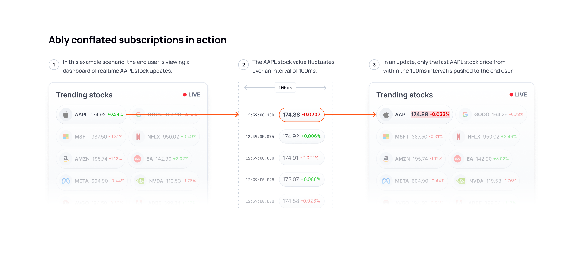
Infographics and data visualization
Data visualization and infographics at Ably have one job: make a technical or commercial argument faster than prose can. Every visual should earn its place by communicating something that words alone would require a paragraph to convey. If a chart doesn't accelerate understanding, it shouldn't exist.
This document covers charts, data tables, stat compositions, and standalone infographic layouts used in blog content, social media, and sales presentations.
Two visual registers
Ably uses two distinct visual modes for data visualization, each suited to a different context. They are not interchangeable.
Light/editorial mode
Typically used for inline blog charts, article callouts, and embedded content within white or light-background layouts.
Characteristics:
- Card container with light grey background (
neutral-100/#F6F8FAorneutral-200/#EEF1F6) - Rounded corners
- Subtle box shadow or border to lift the card from the page background
- Near-black headings (
neutral-1300) in Manrope Bold - Data colors drawn from the secondary palette (see color guidance below)
- Visible but minimal chart chrome: light grid lines, clean axis labels, no decorative fills
- Generous internal padding — the data should breathe
Dark/presentation mode
Typically used for sales deck infographics, social visuals, and standalone compositions intended to stand alone against a dark background.
Characteristics:
- Near-black background (
neutral-1300/#03020Dorneutral-1200/#141924) - Secondary colors used at full saturation to carry meaning and visual weight
- Chart chrome kept to the minimum needed to read the data — axes, grid lines, and tick marks only where they genuinely aid comprehension
- Supporting copy at small size, white or light neutral, to contextualize the data
Do not mix the two registers within a single composition. A dark-background sales slide should not contain a light card chart pulled from a blog post.
Color in data visualization
The secondary palette is the data palette
Orange (#FF5416) is a brand color, not a data color. It should not be used as a generic series color or fill — with the specific exceptions described below. For most data visualization work, reach for the secondary palette: yellow, green, blue, violet, and pink (listed in no preferential order).
The key swatches for each secondary color in data visualization use:
| Color | Key swatch | Hex |
|---|---|---|
| Yellow | Yellow 400 | #FFD43D |
| Green | Green 400 | #08FF13 |
| Blue | Blue 400 | #4AD4FF |
| Violet | Violet 400 | #9951F5 |
| Pink | Pink 500 | #FF17D2 |
In light/editorial mode, prefer slightly deeper stops (500–600) for series colors to maintain legibility against light backgrounds. Blue 600 (#00A5EC) and Green 700 (#008E06) read more cleanly on light cards than their key swatches.
When orange is permitted in data visualization
Orange may be used in data visualization in two specific cases:
-
Identifying Ably directly in a competitive comparison. When a chart compares Ably against one or more competitors, orange identifies the Ably series. All competitor series use neutral or secondary colors.
-
Singular visualizations that are strictly about Ably. When a chart or infographic has Ably as its sole subject — performance benchmarks, uptime history, throughput figures — orange may be used as the primary data color. It should not appear in visualizations that include industry-wide, generic, or third-party data alongside Ably's.
Outside these two cases, orange should not appear in charts, graphs, or data fills.
Status semantics
For availability, uptime, and operational status visualizations, use the GUI status colors as semantic signals:
| State | Color | Hex |
|---|---|---|
| Operational / success | GUI success green | #11CB24 |
| Degraded / warning | Yellow 400 | #FFD43D |
| Outage / failure | GUI error red | #FB0C0C |
These colors carry universal meaning in infrastructure contexts. Do not use them decoratively or for non-status purposes in the same composition — it creates ambiguity about what they mean.
Multi-series charts
When a chart requires more series than the secondary palette can cleanly support, the secondary palette is a practical toolkit, not a brand statement. Pick colors that are perceptually distinguishable from each other at the size they'll be rendered. The colors are doing a job — making series A look different from series B — and that's reason enough to use them. No additional meaning needs to attach to each color choice.
Yellow, green, blue, violet, and pink are the available series colors. Avoid pairing violet and blue in the same chart at small sizes — they're too close in perceptual weight to distinguish reliably.
The one constraint that holds regardless of context: orange is never a series color, even in functional multi-series charts. It reads as a brand signal rather than a data series, which creates confusion about what it means.
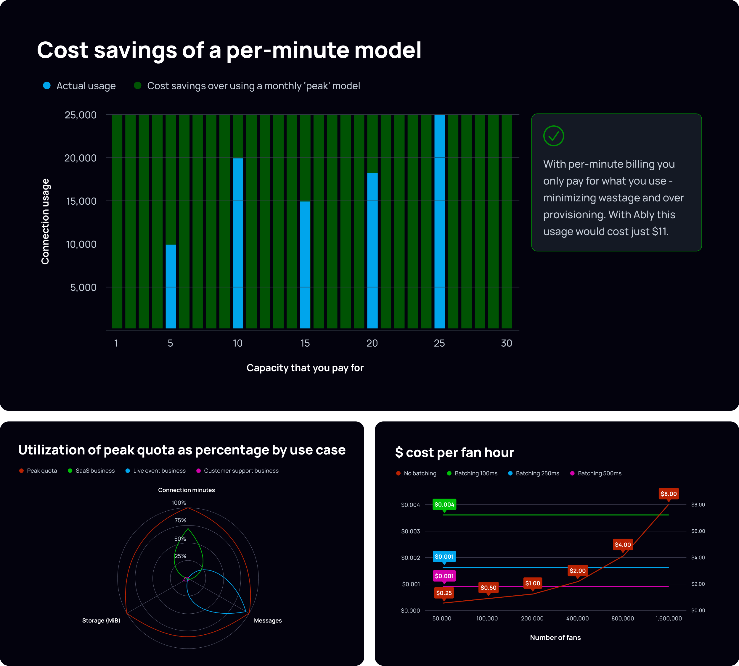
Chart types and usage
Bar charts
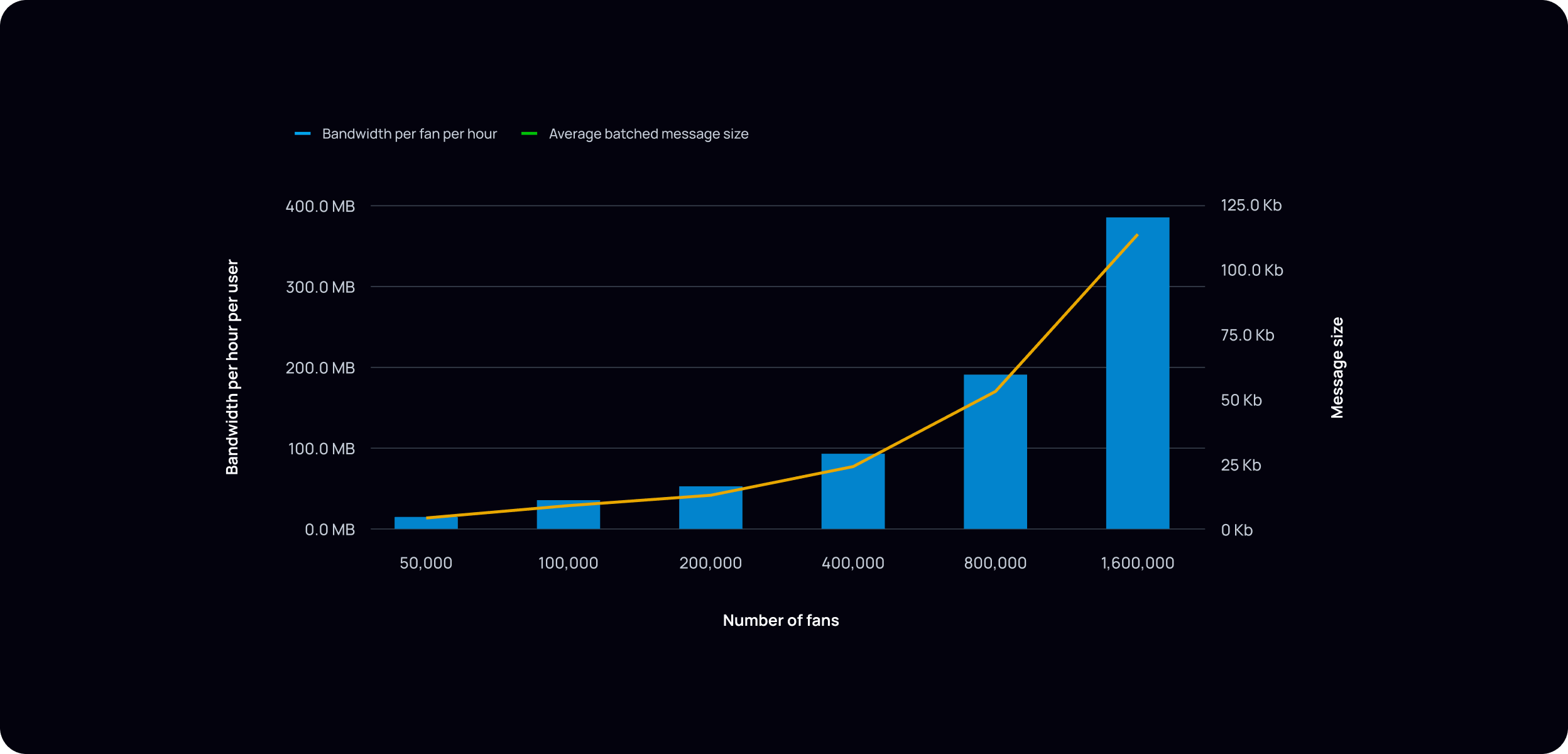
Stacked / overlapping bars work well for before/after or problem/solution comparisons (e.g., actual usage vs. wasted capacity). Use a strong, saturated fill for the dominant message series and a lighter or more muted fill for the context series. The contrast should guide the eye to the argument, not just label it.
Keep bar fills flat in editorial and functional contexts. Gradients or depth effects may be appropriate in high-end marketing compositions where visual richness is intentional.
Grid lines should be subtle and never compete with the foreground data. Use a low-contrast tone relative to the background — light neutral on light backgrounds, dark neutral on dark. Use grid lines only where they genuinely help the reader map values; remove any that don't earn their place.
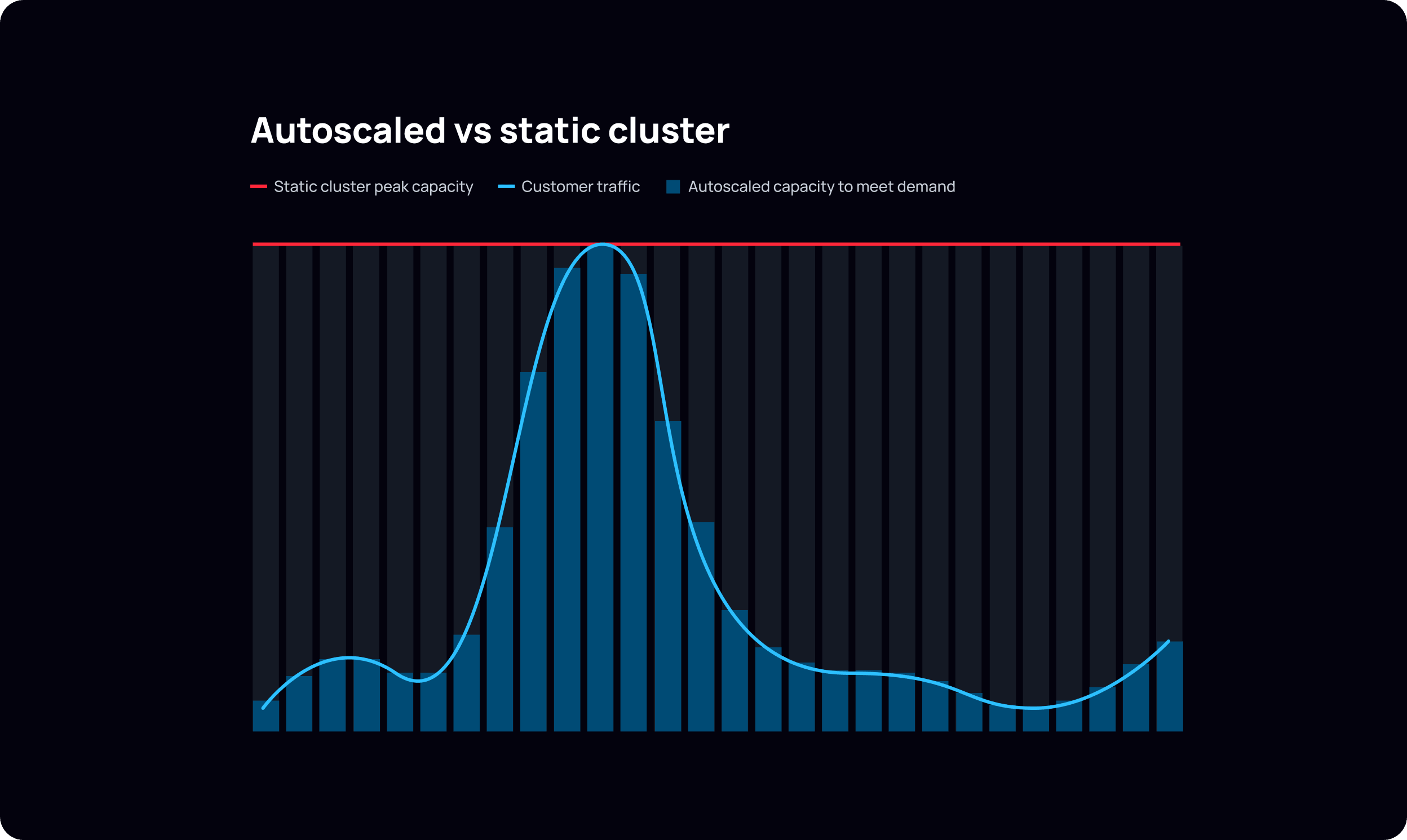
Line charts
Line weight should be substantial enough to read clearly at the size the chart will be rendered — err on the side of heavier rather than lighter.
Annotate key data points with callout labels placed directly on the line, not in a legend offset from the data.
Area fills beneath a line should be used sparingly — only when cumulative volume or a range is part of the argument. Use a low-opacity fill of the series color rather than a solid fill.
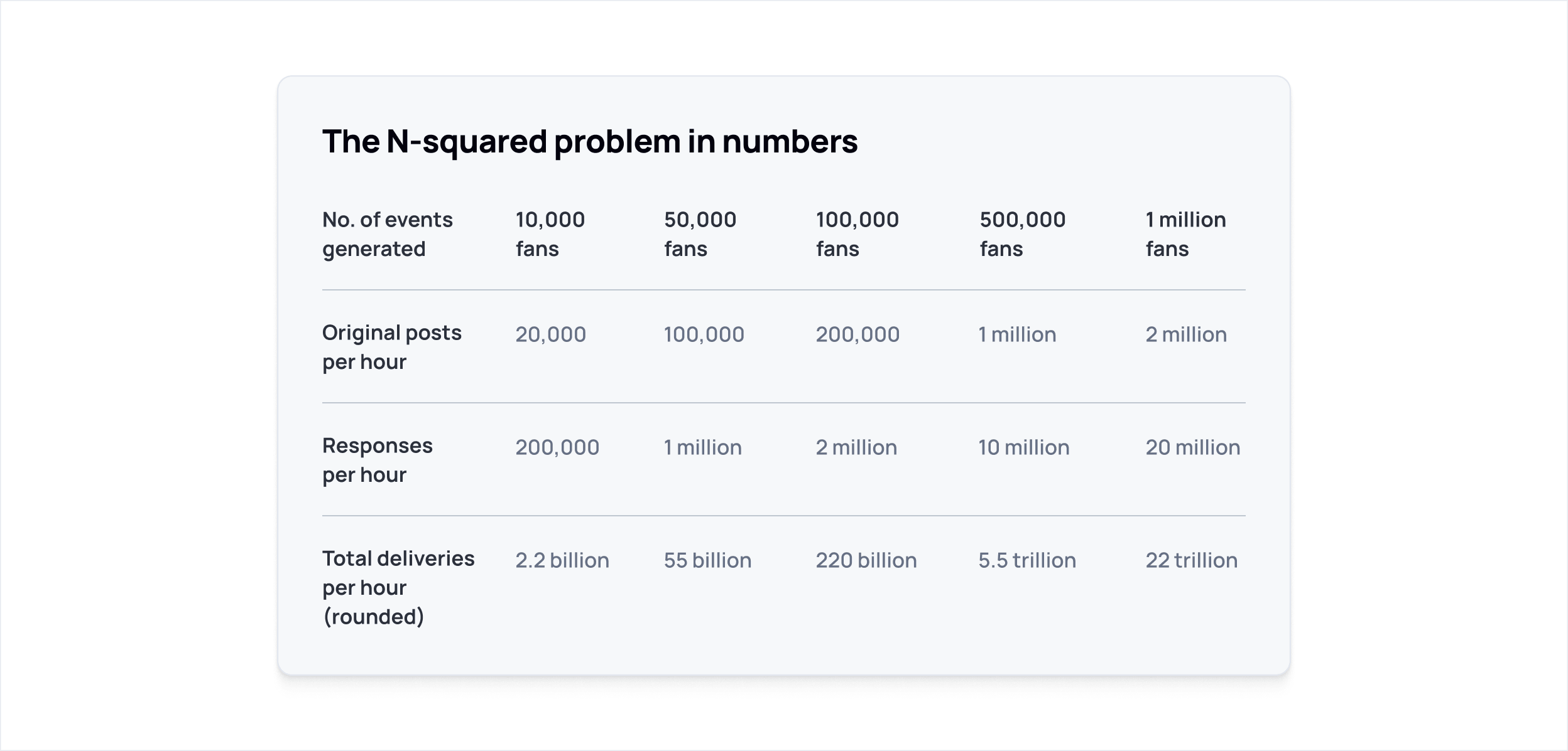
Data tables
Data tables at Ably are editorial, not dashboard-style. They should read like typeset content, not a spreadsheet.
Row dividers rather than full borders keep the table feeling editorial rather than spreadsheet-like. Row label columns work well in Manrope Semibold with data values in Medium — this creates hierarchy without needing size changes. Column headers are typically the same size as body text. Avoid alternating row fills. Right-align numerical data within columns for easier scanning, and prefer descriptive row labels over abbreviations that would require a separate legend to decode.
Horizontal bar survey charts
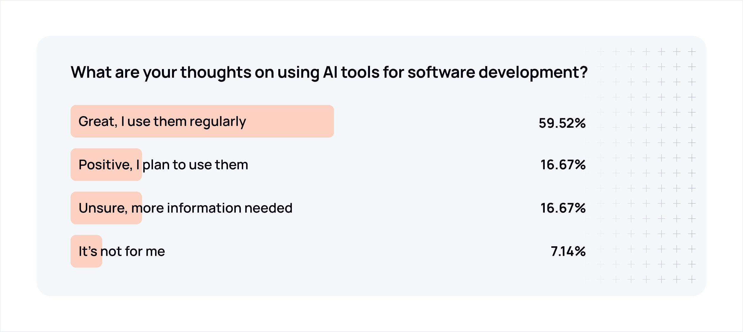
Survey results and proportional data work well as horizontal bars with the label inside or beside the bar and the percentage value right-aligned.
Use a tinted fill of Ably Orange (orange-200 / #FFE3D8 or orange-100 / #FFF5F1) for survey bar fills in light/editorial contexts — this connects the data to the brand without using full-saturation orange as a data color. Bar width is proportional to the percentage value.
Mark the question or data source with a small orange dot or short orange horizontal rule as a subtle brand anchor at the top left of the composition.
Stat and infographic compositions
Large typographic stats
When a single number is the entire argument, let it be. The stat should be immediately readable without reading anything else — scale, weight, and color should all serve that goal. Secondary colors work well for the stat value itself, giving it visual heat against a dark background. Everything else — descriptor, supporting copy, any accompanying graphic — is context.
Long-form infographics
Long-form infographics combine multiple visualization types — stats, unit charts, comparison tables, icon callouts — into a single scrollable narrative. They're typically used for research reports, survey findings, or sales enablement pieces where the argument unfolds across several sections.
The dark/presentation register suits long-form infographics well. Section breaks (horizontal rules, background tone shifts, or spacing) carry the structure in place of the light/dark alternation used in editorial layouts.
Orange appears as a brand anchor — headline accents, bullet markers, graphic elements — rather than as a data color. Secondary colors carry the data.
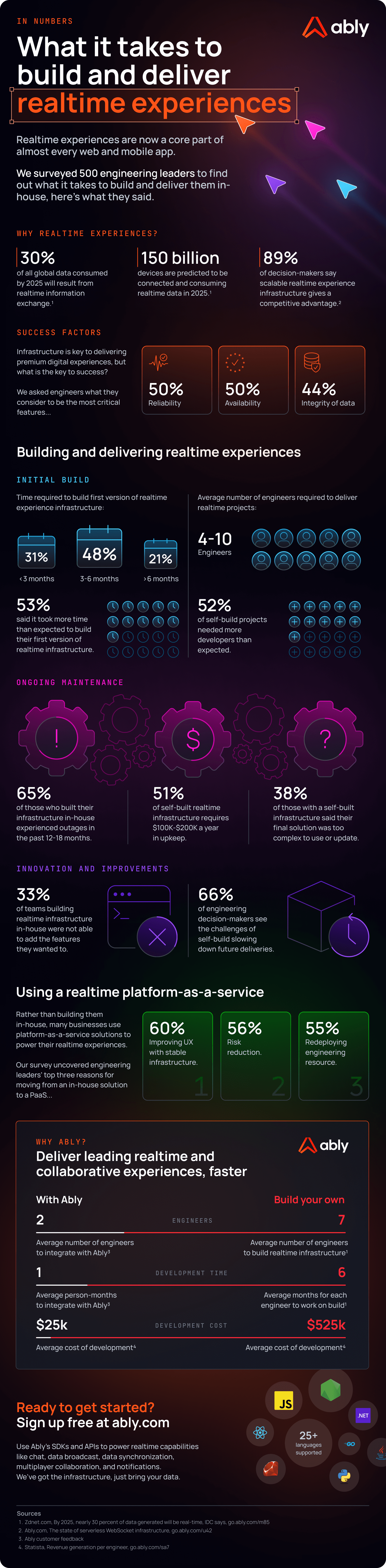
Dot grid / unit chart compositions
Dot or unit grids work well for illustrating the impact of small percentages at scale. A single accent color against a field of neutrals can make the point more effectively than a chart.
Map compositions
Geographic maps work well for communicating infrastructure scale and global reach — datacenter locations, PoP coverage, regional availability. Keep the visual clean; the map itself carries the message.
Typography in data visualization
| Element | Typeface | Weight | Size guidance |
|---|---|---|---|
| Chart title | Manrope | Bold (700) | 16–18px |
| Axis labels | Manrope | Medium (500) | 12–13px |
| Axis title | Manrope | Semibold (600) | 13px |
| Data callout labels | Manrope or JetBrains Mono | Bold (700) | 12–14px |
| Table row labels | Manrope | Semibold (600) | 14–16px |
| Table data values | Manrope | Medium (500) | 14–16px |
| Large stat | Manrope | Bold (700) | 48px+ |
| Stat descriptor | Manrope | Bold or Semibold | 18–22px |
| Supporting copy (infographic) | Manrope | Medium (500) | 14–15px |
| Region labels / technical IDs | JetBrains Mono | Medium (500) | 12–13px |
JetBrains Mono is appropriate for data callout values, technical identifiers (region names, error codes, version strings), and inline data labels where monospace alignment aids scanning. It is not appropriate for chart titles, axis titles, or body copy.
All text in data visualization uses sentence case. Chart titles follow the same sentence case convention as all other Ably headings.
What to avoid
Don't use orange as a generic series color. It reads as a brand signal, not a data signal. Reserve it for the specific permitted uses described above.
Avoid gradients in chart fills in most contexts. Flat fills communicate clearly. See bar chart guidance for when richer treatments are appropriate.
Don't use 3D chart styles. No 3D bars, 3D pies, or perspective effects of any kind. They distort magnitude and add no information.
Don't over-color. When a chart needs more series colors than feel comfortable, it's usually a signal that the chart is trying to show too much. Consider breaking it into smaller charts or simplifying the data model.
Don't use dark/presentation mode elements in light/editorial layouts. The register should match the medium.
Don't add decorative elements to functional charts. A bar chart in a blog post does not need glows, brand patterns, or illustrative graphics.
Photography
Ably uses photography in two contexts: to represent the people who build with our platform, and to ground customer stories in the real-world industries and applications our technology powers.
The Ably visual language is primarily dark-themed and illustration-led. Photography appears where humanity or industry context adds something that illustration cannot — not as a general-purpose background treatment.
People and practitioners
Photography of people is used when representing users, developers, and teams — most commonly in customer case studies, thought leadership content, and anywhere the brand value technology needs humanity needs to come through visually.
The goal is to suggest authentic human moments rather than performed ones. Shots should feel caught rather than constructed — people engaged with work, in conversation, or focused on a task. Avoid obvious stock poses: direct-camera smiles, hands-on-keyboard theatrics, or anything that reads as staged.
Tonal approach — keep colour treatment neutral. Avoid heavy filters, artificial warmth, or high-contrast processing. Images should feel grounded and real.
Subject and setting — workplace and near-workplace environments work well: offices, co-working spaces, informal settings. Technology should be present but incidental, not the focal point. Diversity of representation matters — the people shown should reflect the breadth of who builds with Ably.


Customer and industry context
Where a case study or campaign is grounded in a specific industry or customer application, photography can draw from that world directly — motorsport, live events, sports, healthcare, finance, and so on. These images establish context and signal the real-world scale of what Ably's customers build.
The same tonal restraint applies: natural, unprocessed, grounded in the authentic texture of that industry.


Ably chevron treatment
For rich marketing compositions — hero imagery, campaign visuals, case study headers — photography can be integrated directly into the Ably visual language using the chevron symbol as a compositional device.
The chevron's angular geometry is used as a diagonal mask, splitting the frame between photography and product UI or dark brand space. The photo occupies one zone; the other carries the product story. The diagonal edge is hard and intentional — it should feel structural, not decorative.
Photography in this treatment receives a warm dark colour grade, drawing from the deeper end of the brand orange spectrum. This ties the image into the Ably visual world and creates cohesion between the photographic and designed elements of the composition.
This treatment is reserved for high-production marketing contexts. It requires considered art direction — both the photograph and the product UI need to be selected and composed to work together within the chevron structure.
Voice & Tone
Ably's voice is that of an experienced engineer who has built and operated production systems. Technical without being formal, plainspoken without being clever, and opinionated only when earned. We write to help other teams make decisions they won't regret.
Core principles
- Lead with evidence. Claims require proof: metrics, architecture, case studies.
- Use precise language. "99.999% uptime SLA" not "incredible reliability."
- Write for practitioners. Our audience builds things. Respect their time and intelligence.
- Stay measured. Confidence comes from substance, not volume.
- Teach by showing. Code samples, examples, and working demos over abstract descriptions.
Writing identity
We sound like a senior engineer explaining what they've learned from the field to other senior builders. The tone is calm, practical, and grounded in production reality. We separate what's trendy from what's real. We have strong opinions and back them up with evidence and operational experience, not authority or assertion.
| We are | We are not |
|---|---|
| Technical, not formal | Buzzword-heavy or vague |
| Plainspoken, not clever | Overconfident without evidence |
| Opinionated when earned | Dogmatic or dismissive |
| Focused on failure modes | Focused on happy paths |
| Explicit about tradeoffs | Absolutist |
| Commercially aware | Marketing-led or salesy |
Style essentials
All customer-facing output uses US English (color, behavior, organization). This brand book and its source files use UK English.
- Active voice. "The SDK publishes messages", not "Messages are published."
- Sentence case headings. First word and proper nouns capitalised, nothing else.
- Oxford comma. Always, in every list of three or more items.
- No em dashes. Use a comma, colon, or restructure the sentence. En dashes sparingly where commas would create ambiguity.
- No hype words. Never use: simply, just, obviously, leverage, utilize, facilitate, seamless, game-changing, revolutionary, transformative, next-gen, magical, supercharge, unlock, cutting-edge, best-in-class, unparalleled, world-class, robust, powerful.
- No filler phrases. "Let's explore", "it's worth noting that", "in today's rapidly evolving landscape", "this is where X really shines" and similar throat-clearing constructions are banned.
- Explain mechanisms, not adjectives. "The channel replays missed messages on reconnect" beats "Ably is reliable."
- Name tradeoffs. Every capability has a cost. Name it calmly. Help readers choose rather than declaring a universal winner.
Tone by context
| Context | Tone |
|---|---|
| Website / marketing | Confident, proof-led, benefit-oriented |
| Documentation | Precise, instructive, peer-to-peer |
| Blog / thought leadership | Educational, insightful, generous |
| Social media | Concise, friendly, demo-forward |
| Support / community | Calm, empathetic, solution-focused |
| Enterprise / press | Formal, achievement-oriented, measured |
| Internal comms | Direct, transparent, human |
Do / Don't
✅ "Deliver messages in under 50ms to users across 80+ countries" ❌ "Blazing-fast global message delivery"
✅ "99.999% uptime SLA — six years without a global outage" ❌ "Incredible, industry-leading reliability"
✅ "Get building" ❌ "Unlock the power of realtime!!"
✅ Measured confidence: "We've engineered for this." ❌ Swagger: "Nobody else comes close."
✅ Helpful directness: "Here's how to set up presence in your app." ❌ Condescension: "It's really simple — just follow these easy steps."
Social media and advertising
This document covers Ably's approach to social media and paid advertising asset creation — how brand visual language is applied across formats, themes, and content types.
Asset creation tiers
Ably uses a three-tier approach to social and ad asset creation, balancing creative quality with production volume.
Tier 1 — Custom, design-led. High-value assets created by the design team for campaigns where craft and brand consistency are critical. This document covers tier 1 in full.
Tier 2 — Template-based. (Coming soon.) Design establishes base templates for volume campaigns and A/B testing, allowing broader team members to produce on-brand assets without starting from scratch.
Tier 3 — AI-assisted self-serve. (Coming soon.) Staff use tools like predis.ai to produce assets independently, within defined brand guardrails.
General approach
Social and advertising assets apply the same visual language as all other Ably communications — dark-first compositions, intentional use of orange, secondary palette for product color coding, and Manrope throughout. The constraints are the same; the execution adapts to platform formats and content type.
Assets should feel crafted, not templated — even when the layout is familiar. A post about a new feature should feel like it was made for that feature, not slotted into a generic frame.
Content types
Different post types have different compositional logic:
Feature posts — Anchor the visual in a product UI screenshot or diagram. The image shows the thing; the headline names the benefit or capability. When the post is specifically about a named Ably product, include the product ident (e.g. "ABLY / AI Transport") to orient the reader.
Thought leadership and blog — The visual supports the argument rather than demonstrating a product. An orange content-type label ("WHICH TO CHOOSE IN 2026", "NEW THINKING") signals the editorial intent and anchors brand presence when the visual is more abstract.
Customer examples and case studies — Lead with the customer's words or outcome. Product UI or integration visuals provide context. The "CUSTOMER EXAMPLE" label, in orange, identifies the content type.
Campaign and advertising — Proof-point led. Large, bold headline stat or claim, minimal supporting copy, single CTA. The visual hierarchy should be readable at a glance without stopping to read.
Carousel / LinkedIn sequential posts — Each panel must work as part of a sequence and standalone. The cover panel carries the hook; subsequent panels each make a single point. The final panel typically carries a CTA or summary.
Light and dark theme variants
Ably social assets are produced in both dark and light theme variants. The two registers use the same layout, the same type hierarchy, and the same structural elements — only the background and foreground color values change.
Dark theme uses
neutral-1300(#03020D) orneutral-1200(#141924) as the background. White (neutral-000) for primary text. Secondary palette colors and orange at full saturation.Light theme uses white or
neutral-100(#F6F8FA) as the background.neutral-1300for primary text. Secondary palette colors at slightly deeper stops for legibility (500–600 range).Orange accents — the data sparks graphic element, the brand shield icon, the logo — read consistently across both themes. The core brand color does not change between registers.
When producing assets for a campaign, both variants should be created from the same layout. Platform context and A/B testing will determine which performs better — the brand system supports both equally.
Aspect ratios and layout
Common formats
Layout structure
Most single-frame posts follow a consistent two-zone structure:
Upper zone — Visual content: product UI screenshot, illustration, diagram, or icon. This zone carries the "show" part of the message.
Lower zone — Text content: product ident (when relevant), headline, supporting copy (when needed), CTA (on ad formats). This zone carries the "tell."
The Ably logo sits top-left in all formats. It should be the first thing in the composition, not an afterthought.
The headline is the dominant text element — Manrope Bold, sized to carry visual weight against the image. It should feel large and confident, but balanced with any accompanying description copy and the visual in the upper zone. The relationship between headline size, supporting copy, and image should feel considered, not crowded.
CTAs on ad formats use an arrow (
→) rather than a button. They sit at the bottom-left, in Manrope Semibold.