09
Diagrams
It's useful to support communications for our product and services with diagrams which are intended to help the viewer understand complex concepts.
Our diagrams follow a developing style but generally use line-art for objects, solid fills for encapsulation, and directional lines for data flows. They are often animated and so any author of a diagram should keep this in mind when creating new collateral.
Examples
Pub/Sub:
Click here to see live animated version- Objects in black and white line-art, and some subtle fills if required.
- Directional flows as lines.
- Ably services often represented in the centre via the logo 'a'.
- Keep description labels short and focused.

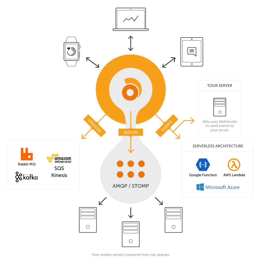
Ably API Streamer:
- It's sometimes unnecessary/useful to encapsulate thematically linked areas.
- Include logos for 3rd party technologies where appropriate.

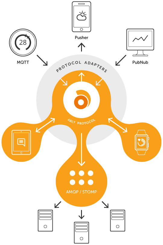
Reactor:
- Visualising layers of services by placing Ably at the centre and wrapping/linking appropriate devices and features around it.
- Note how there is always an attempt to retain som symmetry.

Miscellaneous:
- Always try to retain an overall light tone, even when there are many elements required to tell the story.
- It often helps to color cordinate data flow lines.
- Try to re-use objects that have already been illustrated to retain consistency.
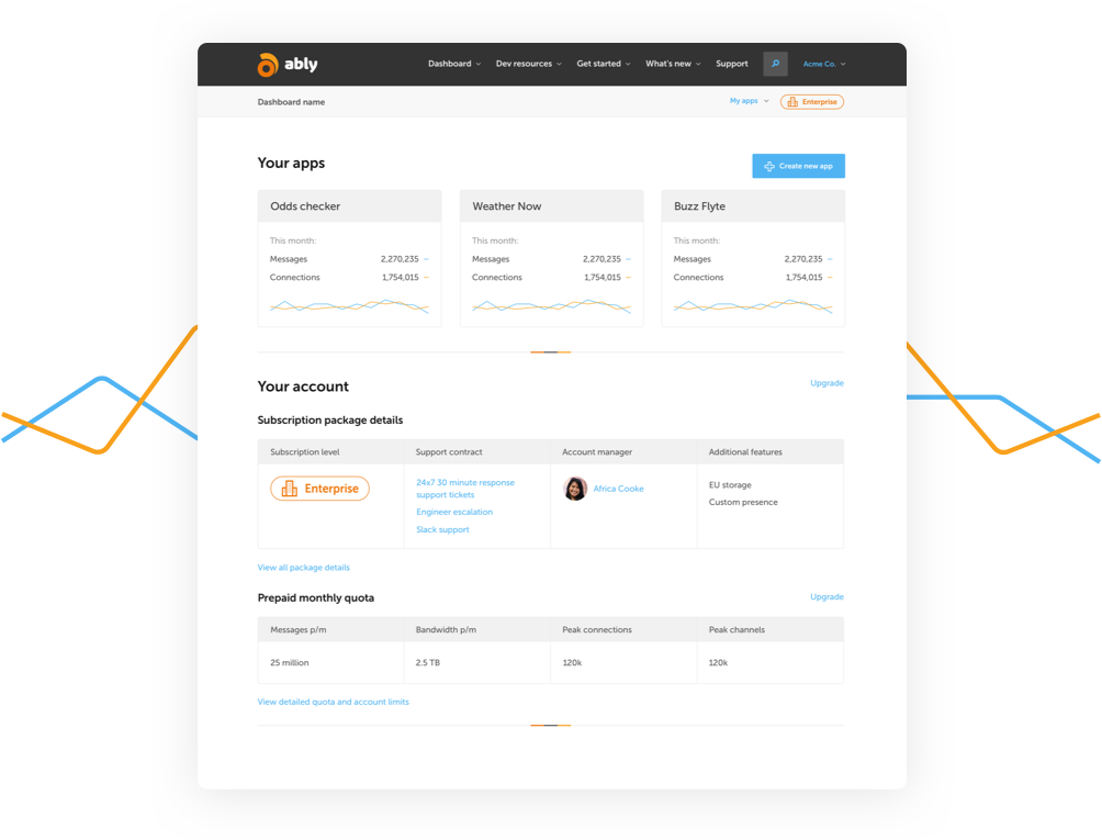
- Feel free to mix in more literal items like screenshots but ensure they have sense of being designed considerately.
- Don't be afraid to add some character when the theme supports it - like bugs and critters bouncing off a security layer.
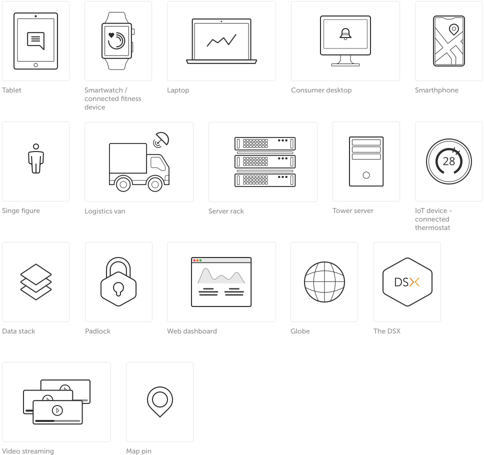
- Some objects from the Lineart UI icon set can help to support custom elements.


Object library

Resource
Object library

