05
Typography
Our font, Museo Sans, should always be first-choice for all of our communications.
Museo Sans 700 for headers:
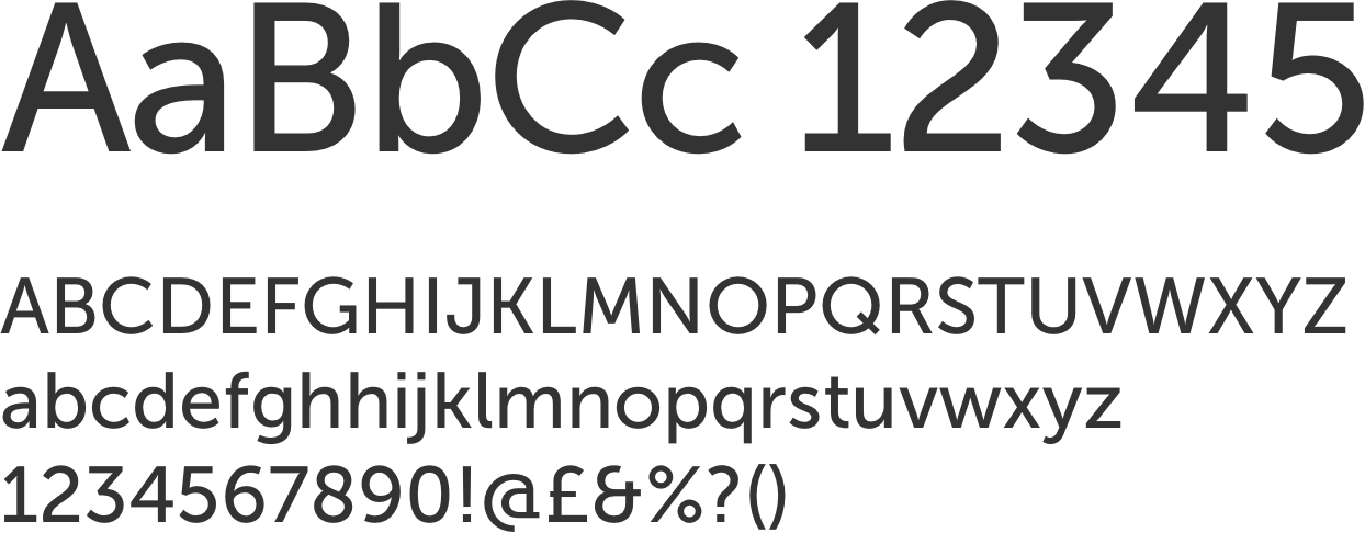
Museo Sans 500 for body copy:

Museo Sans 300 for occasional creative use:

Note that we use scale and color rather than reaching for bold weights when creating typographic hierarchy. Let’s put all this together in a basic example:
Primary (e.g. page) header
Rich orange stand-first for attention running over multiple lines
Secondary (e.g. section) header
Tertiary (e.g. sub-section) header
Body copy, it must be said that the monkey-rope was fast at both ends; fast to Queequeg's broad canvas belt, and fast to my narrow leather one. So that for better or for worse, we two, for the time, were wedded; and should poor Queequeg sink to rise no more, then both usage and honour demanded, that instead of cutting the cord, it should drag me down in his wake.
Paragraph header
So, then, an elongated Siamese ligature united us. Queequeg was my own inseparable twin brother; nor could I any way get rid of the dangerous liabilities which the hempen bond entailed.
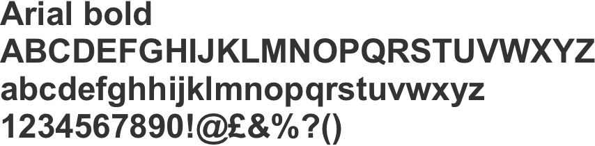
In the rare case where Museo Sans is not available or cannot be reliably defined in digital comms, such as email, our fall-back font is Arial regular/bold.