03
Logo
Our logo is our badge of quality and a reminder of our values every time a customer sees it.
Logo anatomy
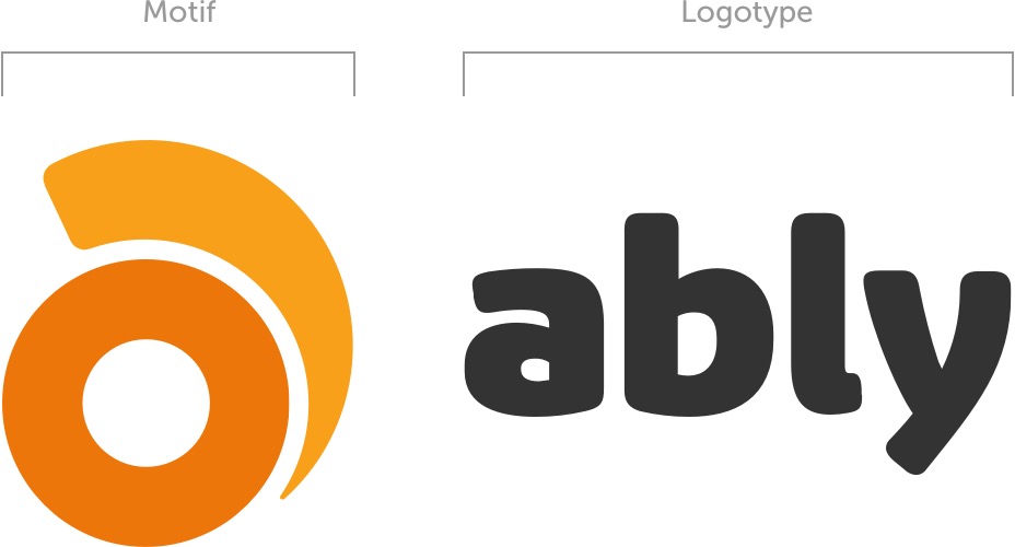
The Ably logo is made up of two distinct elements, the motif and the logotype. The motif is an abstracted letter ‘a’ representing data streaking around a globe. The logotype uses a solid yet approachable font to carry our name.
Clear space
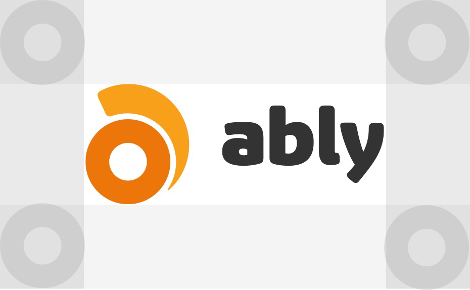
To retain clarity and consistency when using our logo, please observe the following:
Space equal to height and width of circle in logo motif
Color and usage
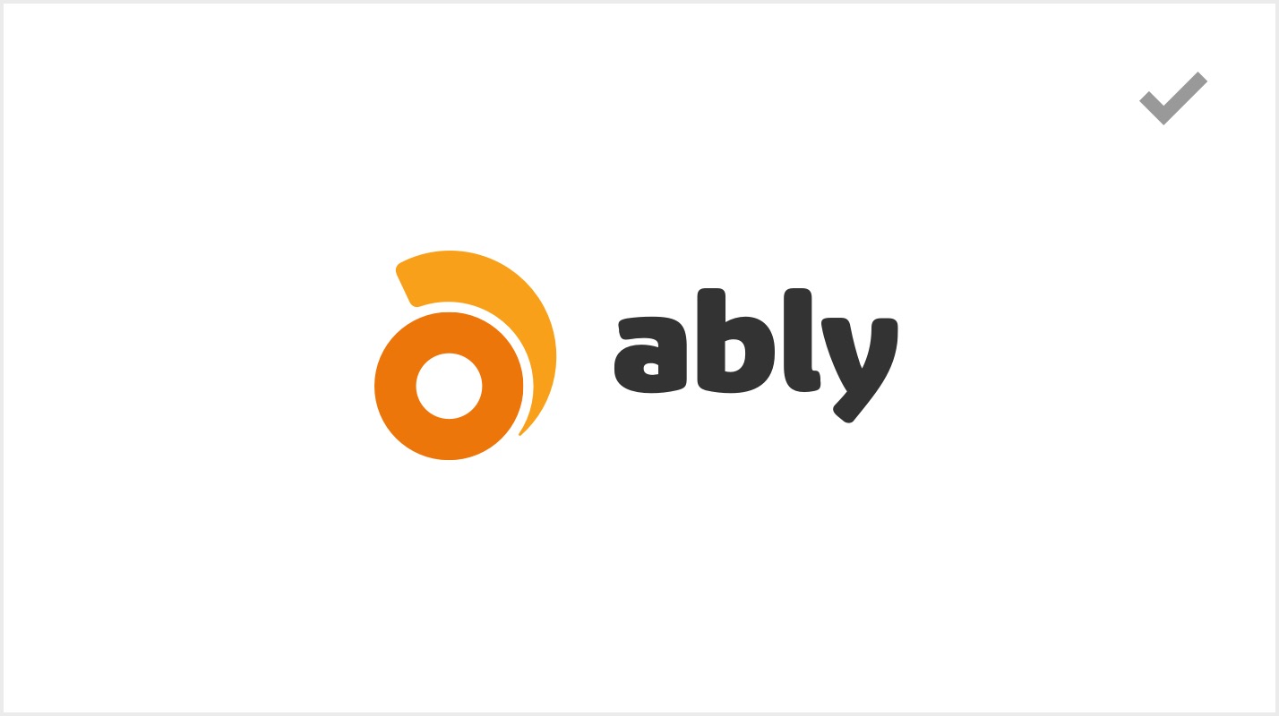
The Ably logo is available in full color, reversed, white-only, and black-only. Here’s how to use each one correctly:
Our full-color logo should always be primary choice
On darker backgrounds, we retain the color motif but with white logotype.

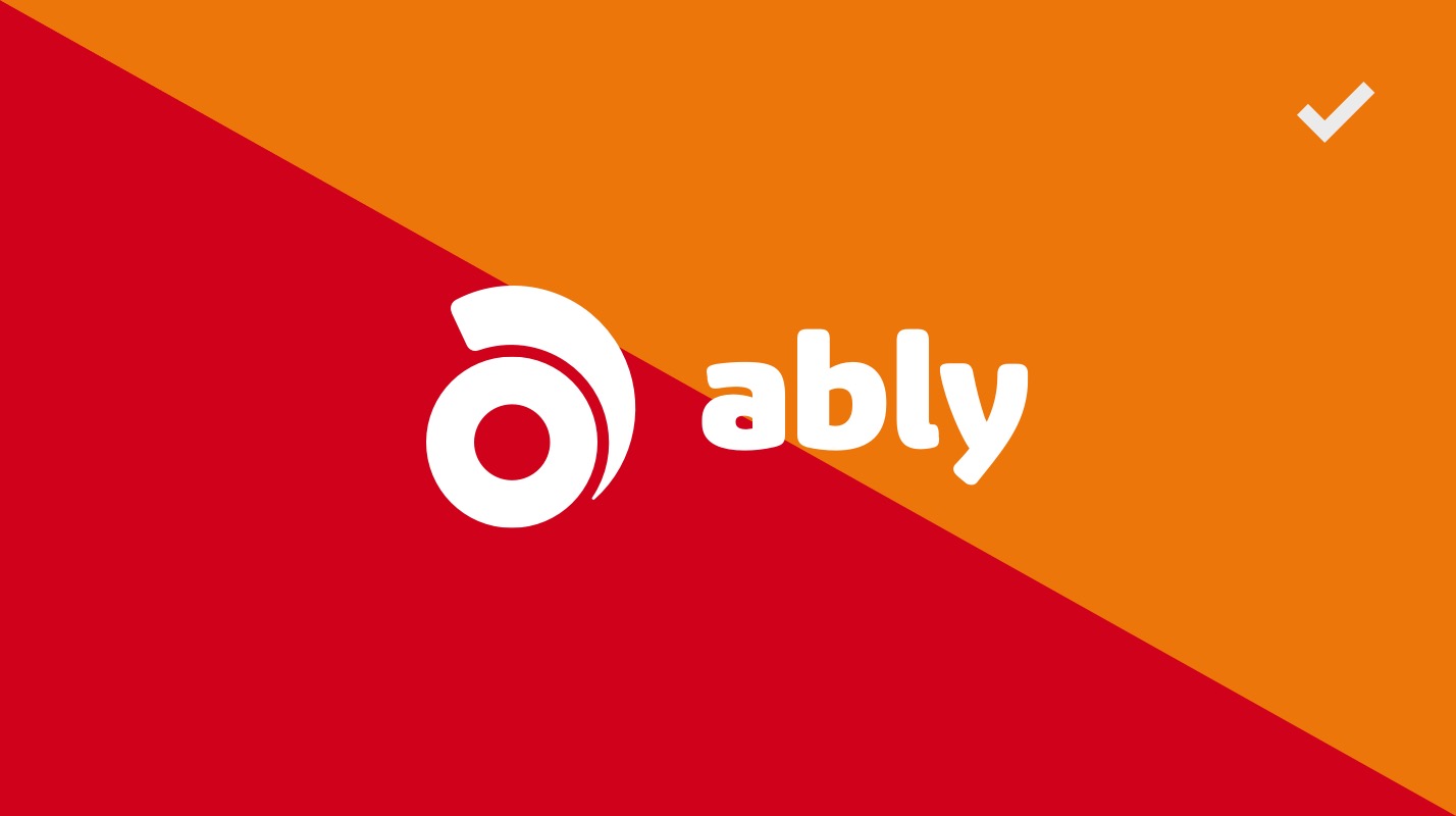
On backgrounds that match or are close to any logo color, an all-white version should be used.
Similarly, on photographic backgrounds the all-white version should be used.
Animation
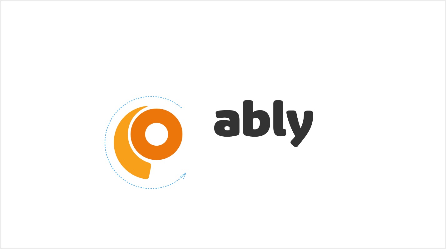
The logo was designed to incorporate motion. When appropriate, using the animated logo can add visual excitement and energy.
Social network badge
The motif from our logo should be used for social media badges, observing the color rules.

Resource
All logos
Animation
Social Badge
